Data Curious 06.12.2018 - the Awards, World Language Dictionary and learning through gifs

06.12.2018
After a brief hiatus for Thanksgiving week (and the one after), I’m back with more data resources for the week.
During that time, two big awards happened in the data viz world: the highly acclaimed Information is Beautiful Awards, and the new but equally as exciting Pudding Cup. Scroll through each list for some great inspiration.
Now let's get to it.
Read_
FitBit analysis, humanising data, chart legends and planning for data products
Can analysing FitBit data lead to a healthier life?
Yash Soni thinks so. This Medium article summarises his analysis of FitBit data, with some interesting charts on his weekly habits (Jupyter notebook included).
Get fit →
How can we explore hard issues and trauma through visualizing data?
Giorgia Lupi has become one of the leading voices in what has been coined "data humanism", meaning the practice of making data more human through visual exploration. This blog post describes her collaboration with musician Kaki King: a data illustration exploring the frustrating and confusing experience of parenting a child with a chronic illness.
Should I really be using chart legends anymore?
Eh, sometimes. But I think we are starting to outgrow the need for them.
How can I better plan for data-driven products?
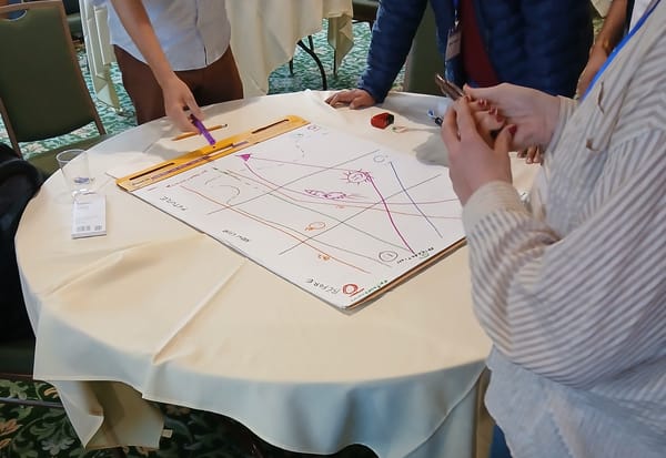
DATOM is a new canvas-based method for creating data-centric products and services. Think of it as a starting point for your next whiteboard session.
Explore_
Thanksgiving chatbots, populist Europe, and TV's golden age
Thanksgiving drama: how do I not have an argument with Angry Uncle over politics?
If you're American, you will surely be familiar with this phenomenon. The NYT created an interactive chatbot to simulate a Thanksgiving conversation around politics. It uses data and preset responses to create empathy in the user, something that the world could always use more of.
Hello. It's me. That one uncle. →
Is Europe really swinging populist?
Exclusive research from the Guardian shows that one in four Europeans now vote for populist candidates. This data-driven story has some great design choices and impactful charts throughout.
Are we living in TV's golden age?
Data says yes, according to IMDB. Although it's not always the most trusty of sources, I love this interactive visualisation from the Economist team. Also: remember the X-files?
Analyse_
Gender wage gap, ParlGov, and a dictionary of world languages
How wide is the gender wage gap across different occupations?
Enigma Public is a great place to discover open datasets. Here's a recent one I found on the gender wage gap for major occupations. If you sign up with a username, you can also access their datasets through an API.
Nice one →
Where can I find data on governments and parliaments across the world?
If you do any work in political science or international development, you should know about this website. It contains data on 37 countries throughout the EU and OECD democracies.
What do words mean to different people around the world?
Check out this mental dictionary of the languages of the world (h/t to Jeremy Singer-Vine on this one).
Learn_
Time-saving Python libraries, visualising trade networks, and quick visual EDA
How can I quickly produce summaries of long articles using NLTK?
This introductory article to text summarization and the TextRank Algorithm provides a great walkthrough. The author goes step-by-step from scraped articles, to corpus of text, to vectors, and finally to the top-ranked items from each.
What are some quick tips that will help me make consistently beautiful charts?
Sometimes, one gif can tell an entire story. That's why I'm linking to a tweet first, and then you can find the resource from there. It shows how one bland chart goes from straight outta matplotlib, to something you might see on a news site like the Financial Times.
Spread the love.
Share this edition of Data Curious.

Thanks for reading. More to come next week.
Ben_ say hi: twitter | medium | github


