📊 Announcing Data Curious: the first edition 📈

11.10.2018
Welcome to the first edition of Data Curious. Each week I’ll be sending data articles to read, visualisations to explore, datasets to analyse and tutorials to learn from.
If you’ve got more questions, check out this intro article on why I started this newsletter. I’d also love to hear your feedback.
Let’s dive in.
Read_
Visual health histories, astrology obsessions and data-informed cultures
How can we create visual health histories that help doctor's give a more accurate diagnosis?
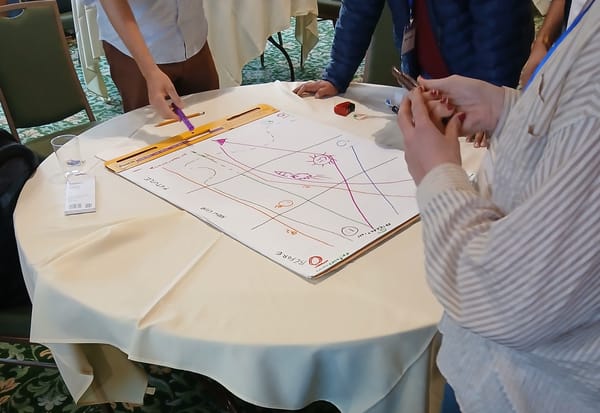
Katie McCurdy is creating an innovative new way to create visual health histories with a project called Pictal Health. After listening to patient's symptoms, she creates a visual summary using charts and shapes that provide an overview of symptoms across the patient's life.
More →
Astrology: should anybody really care?
This is an edition from one of my all-time favourite newsletters, Quartz Obsession. It's not a data newsletter specifically, but in keeping with Quartz's natural curiosity, they always include stats and figures from research studies on each topic. Consider it a helpful launching point if you're looking for a new topic to do for your next story or analysis.
Is there a difference between being data-informed and data-driven?
Uzma Barlaskar thinks yes. And by the end of her piece, I think I agree with her. Data should be one of many variables, not the only variable.
Explore_
#MeToo changes, workplace habits and how a neighbourhood can shape the future of children
Can the #MeToo movement on social media really inspire meaningful change?
This scrollable data viz seeks to find the impact of social media activity in a beautiful way.
Explore →
Do people cover up their true selves at work?
A new project created by Beyond Words Studio for totaljobs.com visualises the result of a recent survey on workplace habits in a fun and interactive format.
How does a child's neighbourhood shape their future economic outlook?
NYT’s the Upshot produced a series of stunning interactive maps that show, block-by-block, the potential life outcomes for children in poverty.
Analyse_
Bike rentals in London, endangered species habitats and Nobel Prizes
How many TFL bikes (and where) are checked out each week in London?
Satisfy your Boris Bike curiosity here.
Dive in →
Where are the critical habitats located for endangered species in the US?
The FWS Threatened & Endangered Species Active Critical Habitat Report has data to map it out.
How many women have won Nobel Prizes?
The NYT recently released an article to commemorate the 3rd ever woman to win the Nobel Prize in Physics. Take a dive into this dataset to practice some newsworthy analysis.
Learn_
Essential cleaning in Python, building your first chatbot and making gif maps with pure code
What are some essential methods I need to know to clean a dataset in Python?
Sometimes it's good to get back to the basics. Or even start with the basics. This is a clear, concise summary of the most essential methods and attributes to know when getting started cleaning a dataset in Python.
Sounds smart →
How can I start building a chatbot in Python?
Chatbots are all the rage. But you don’t have to have all the skills of a full stack data scientist to get started. Just some basic Python and NLTK.
How can I create gif maps without having to use Photoshop?
All you need is Python and the command line. Disclaimer: this tutorial is from me. And it includes fully reusable code to start creating gif choropleth maps in a Jupyter Notebook.

Thanks for reading. More to come next week.
Ben_ say hi: twitter | medium | github
Spread the love.
Share this edition of Data Curious.


