
A new wave (and first post on Ghost)


Hello,
This is my first edition of Data Curious on Ghost. In last week's post, I explained some of my thinking behind making the switch, so I won't re-hash it here.
Instead I'm thinking ahead—I have written some version of this newsletter for the past 8 years. It started as only focused data visualization, sharing interesting charts and graphs. As my work evolved, it expanded into neighboring fields like creative coding, data sonification, data ethics, and more. I suspect this will always be the case—much like my own professional life, this newsletter will grow and expand with my interests.
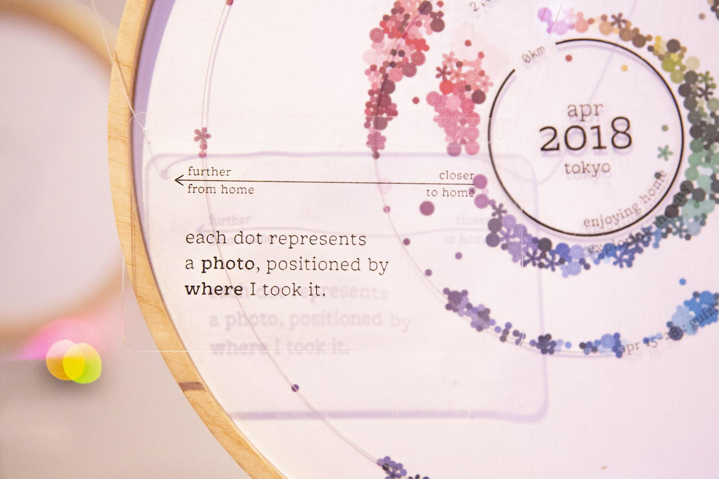
But recently, a reminder popped up which highlighted the through-line of this publication. Many times I struggle to define my work. I could say "I do data visualization", which I do, but really I work with data as material. The outcome of this material can take many forms—visual, sound, physical object, experience.
A recent series by data artist Shirley Wu (linked below) on the state of the visualization industry (and where we head next) speaks to exactly this point. It reminded me why I keep writing this thing: I am interested in discovering new ways of telling stories with data, creating human experiences with data, and building community resilience through data.
I'm not as interested, per se, in "how to make a better chart." It's part of my job sometimes, but it's not a big part of this newsletter.
Here's what I will continue to do: I'll share the things that sparked my curiosity, with something to read, to explore, and to learn from each edition. I'll keep sharing how my work communicating and creating with data is changing and growing. And I'll hold all these things lightly, honoring that most human of qualities and rights—to change my mind.
Read
Beyond the plateau
In her third post on the state of the data viz industry, Shirley shares where she hopes the field will move next. This is in conversation with other recent posts by long-time contributors of the field, such as Moritz Stefaner's "What crisis?" and Amanda Makulec + Elijah Meeks' "Fourth Wave of Data Visualization".
All of these articles are well worth the read, but I wanted to highlight Shirley's specifically as it centers on the recurring theme of this newsletter—seeking new experiences of, and through, data.
'If we want to push our creativity forward, we need to broaden our scope of “proper” data visualization, or even our scope of data art. In fact, I am convinced that what we currently consider “Unusual” will drive our next cycle of experimentation and innovation. But Shirley, you might say, the “Unusual” category encompasses sonifications, physicalizations, smellifications. Those aren’t data visualizations. And you’re absolutely right. Which is why I want to take it one step further: not only do we need to broaden our scope, but we also need to redefine what we stand for. Recently, I’ve become a fan of the term “data experiences.”' - Shirley Wu
Explore
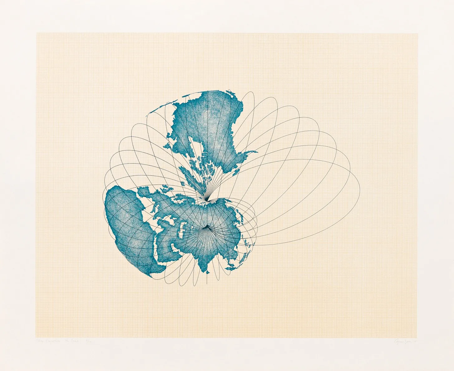
Agnes Denes - a "study of distortions"
I discovered the work of Agnes Denes through RJ Andrew's wonderful newsletter Chartography. In a recent edition, he shared some stills of Denes' isometric map projections, which she calls a "study of distortions". I found them beautiful and strange. Naturally, I dove down a rabbit hole of her previous work as well.
Denes is a pioneer of land art, using natural living things and seeds to create living, growing artwork. In Wheatfield - A Confrontation, she planted two acres of wheat on a landfill in downtown Manhattan in an act of protest against economic inequality and global warming. For Tree Mountain, she had 11,000 people plant 11,000 trees in a sort of fractal spiral shape in Finland.

These artworks unfold on the scale of years, even decades. Their careful use of geometry and arrangement reminds me a lot of visualization—an act of arranging, re-arranging. And even better I'd argue that these works are autographic visualizations in themselves (previously covered in this newsletter here).
Learn
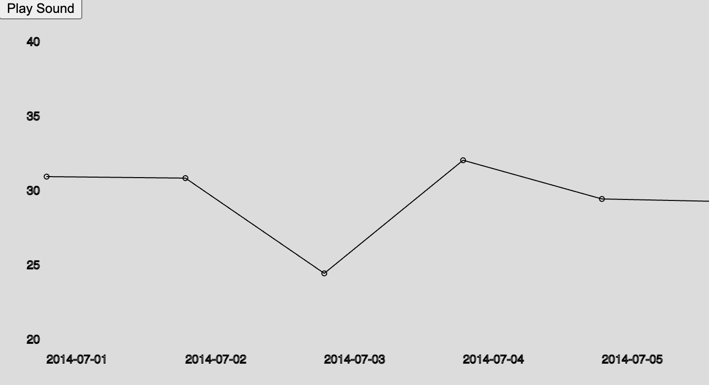
Web sonification with P5.js
Earlier this week I delivered a guest lecture on data sonification. I did my best to compile some good tools for getting started, even if you don't know how to code. For those who do know a bit about code, this bare-bones example of sonifying a line chart using P5.js and Tone.js is a good start to wrap your head around it.
That's all for now. If you have any thoughts, reply to this email! I have a fancy new email with a custom domain setup now, and the serenity of an empty inbox is nice, but can feel a bit lonely :).
Till next time,
Ben


