
Critical Data Thinking
Distorted projections, dishonest charts, digging out deleted data

The last newsletter I posted was before inauguration day, something that feels like a year ago. Not a day goes by that I don’t think about this clip:

The new administration has used chaos, confusion, and shows of power as a tool to keep the wheels of outrage and anxiety spinning. This newsletter will be about the opposite of that: it will be about slowing down and thinking critically about the data around us.
In the spirit of the above, I’m keeping this intro brief. Here are some links.
Read
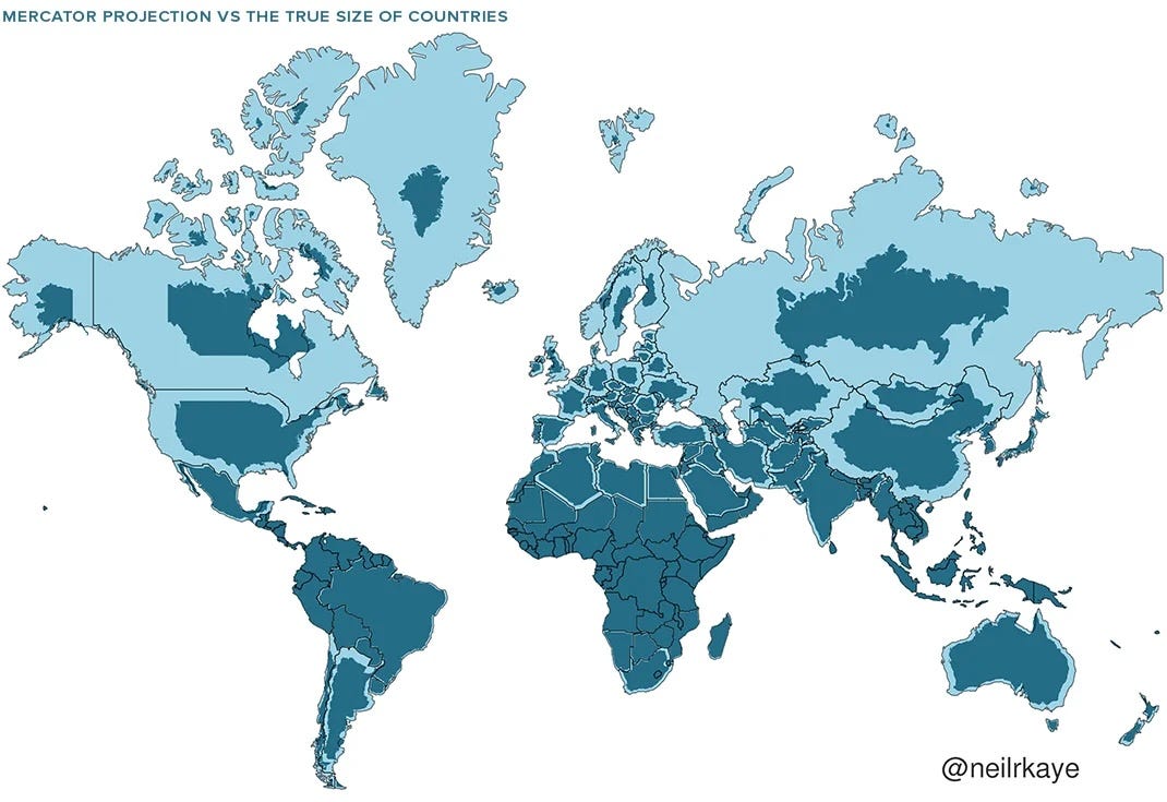
This Map Helps Fascists
A timely reminder that the Mercator projection was meant for naval navigation and therefore hugely distorts land mass. Greenland is actually...not that big. So much of visualization work acts on the assumption that size = importance, a dangerous premise. The quote below sums it up nicely (bolding my own).
"The distortions of the Mercator projection don’t just exist in some theoretical vacuum—they’re a reminder of how easily visualizations can be weaponized to amplify or bury ideas. To counteract this, we need to get better at asking specific questions: Why this projection? Why these data choices? What’s being highlighted or hidden?"
Explore

Defense Against Dishonest Charts
Nathan Yau (aka FlowingData) recently released a new interactive story that teaches you how charts can lie, a skill that feels more important now than ever. Each visualization has a slider which shows how changing the axes, or shrinking the scale, or exaggerating a trend can dramatically change a charts meaning.
It’s a masterclass in data visualization literacy, and perhaps the most concise and effective one I have ever seen (for a more longform lesson on how to spot chart lies, read Alberto Cairo’s book How Charts Lie).
Learn
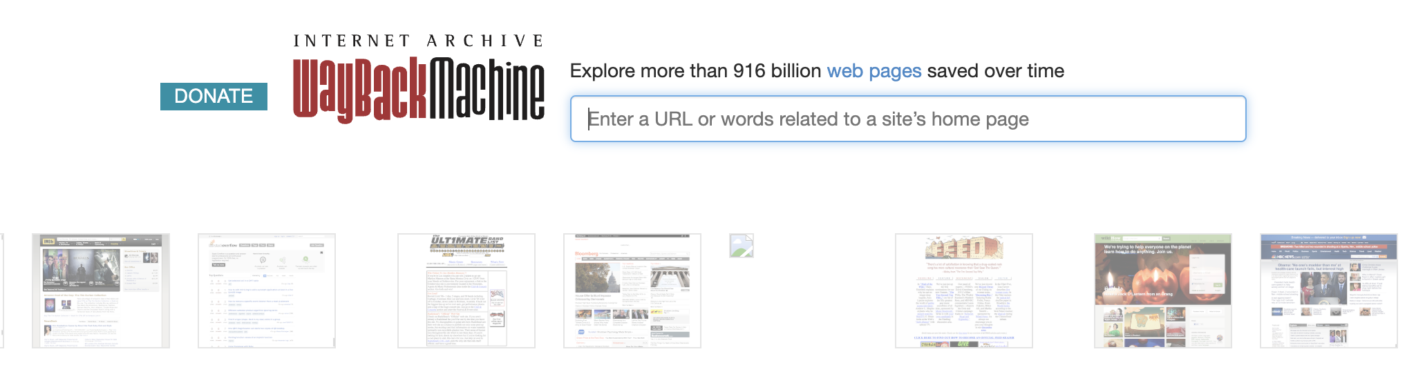
The Wayback Machine
Earlier this month, the NYT reported that almost 8,000 government websites containing data—on health, the environment, demographics—had disappeared. Some have come back online, but others are in limbo. Hiding previously open, credible data in this way is a move against science and against a well informed public. Luckily there are tools to help get around this. Here are two to get started:
- The first is the data.gov archive, started by the Harvard Law School Library—a “6TB collection include(ing) over 311,000 datasets harvested during 2024 and 2025, a complete archive of federal public datasets linked by data.gov.”
- The second is The Wayback Machine, a tool developed by the Internet Archive which allows you to revert to a webpages previous versions to see what it used to look like (including links to PDFs or Excel files that are now broken or vanished). Learn how to use the tool here.
That’s all for this week.


