
Data footprints
An AI-driven data viz film, the new normal in search, and Observable Plot cheatsheets

Search data seems to be the ubiquitous thread that connects us all. And one company stands to benefit most from that thread: Google. In 2018, a report showed that Google 90% of the internet-using world uses Google.
This issue highlights a few projects that use search data in interesting ways, weaving them into stories and narratives that can reconstruct the past.
But first, I have a small project that I’ve been working on which I’m excited to start releasing and share with you all.
Drone Paintings
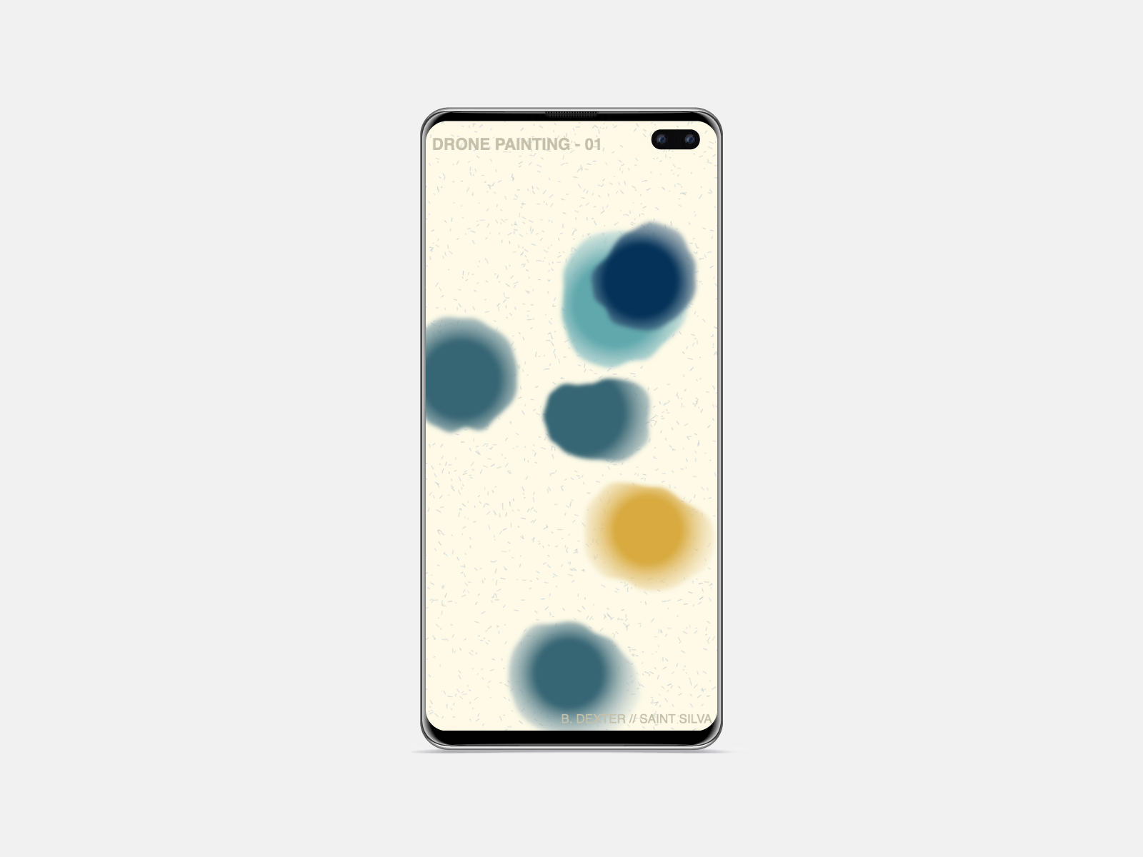
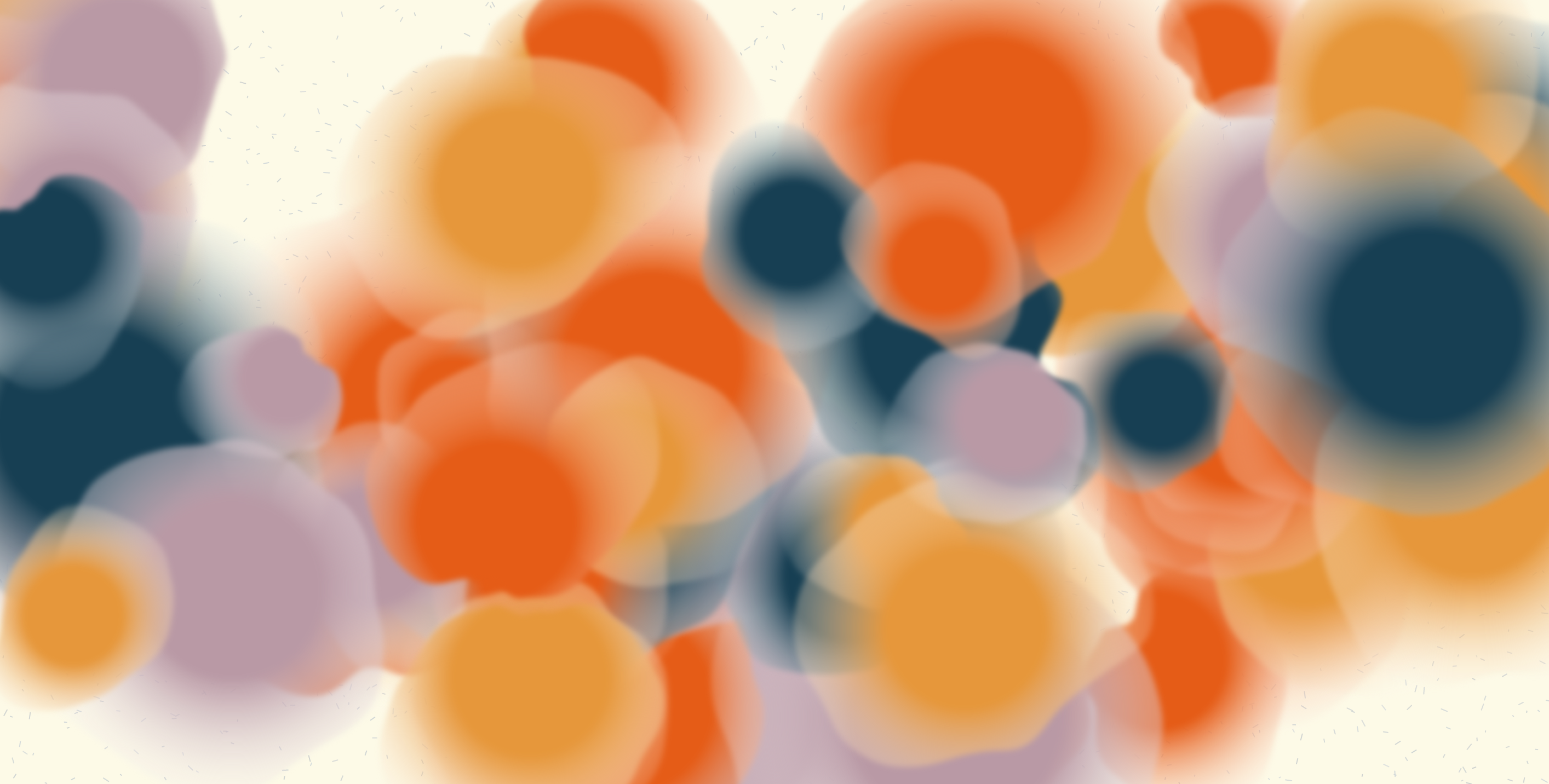
For a while now, I’ve been exploring the potentials of creating music through generative systems (sometimes data, sometimes randomness). Today I launch the first in what I hope will be a series of “drone paintings”.
What is a drone painting? It's an audiovisual experiment made up of two components: a set of synthesizers playing generative melodies (audio) and randomly dropped "watercolor" blobs (visual).
By generative, I mean that the music creates a random sequence of notes within a set scale. This means that the melody and timing of notes is always changing, shifting. I wrote much more about how and why I created the piece (in addition to some generative nerdery) in an essay on my notepad, so I’ll leave it there for now.
You can see a preview of the piece in the thread below, or even better, experience it for yourself: Drone Painting 01 is a plain old website: https://drone-paintings.netlify.app/
New music! Introducing Drone Painting 01, an audiovisual experiment: a set of synths playing generative melodies (audio) and randomly dropped "watercolor" blobs (visual). Made with @p5xjs + #tonejs. Listen at the link 👇 #ambientmusic #generativeart
— Ben Dexter Cooley (@BenDexterCooley) 4:35 PM ∙ Jan 28, 2022
drone-paintings.netlify.app
Now onto the regular programming/link sharing.
Read
Made to Measure transmedial art exhibit case study
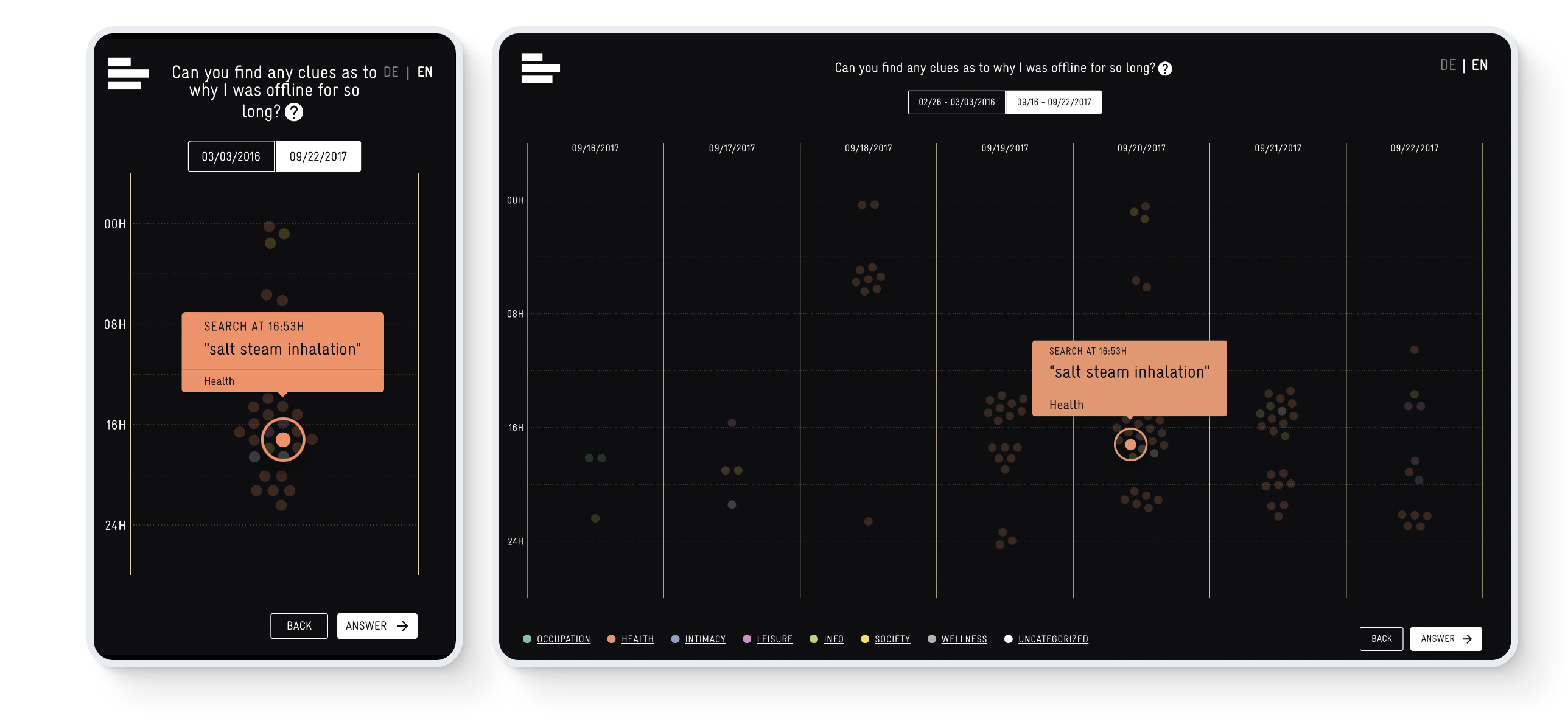
This case study from Studio Nand paints a fascinating picture about their collaboration with art collective Laokoon. For their AI-driven, interactive film, Studio Nand created an interactive cross-media website that walks viewers through the data points that make up an “anonymous” storyline. These disparate data points like search terms and website analytics make up the “data footprint” of an AI. Linking these data points together creates a unique story. Wish I could have seen the exhibit for myself, but for now the screenshots and write-up are all I have for inspiration.
Explore
The New Normal
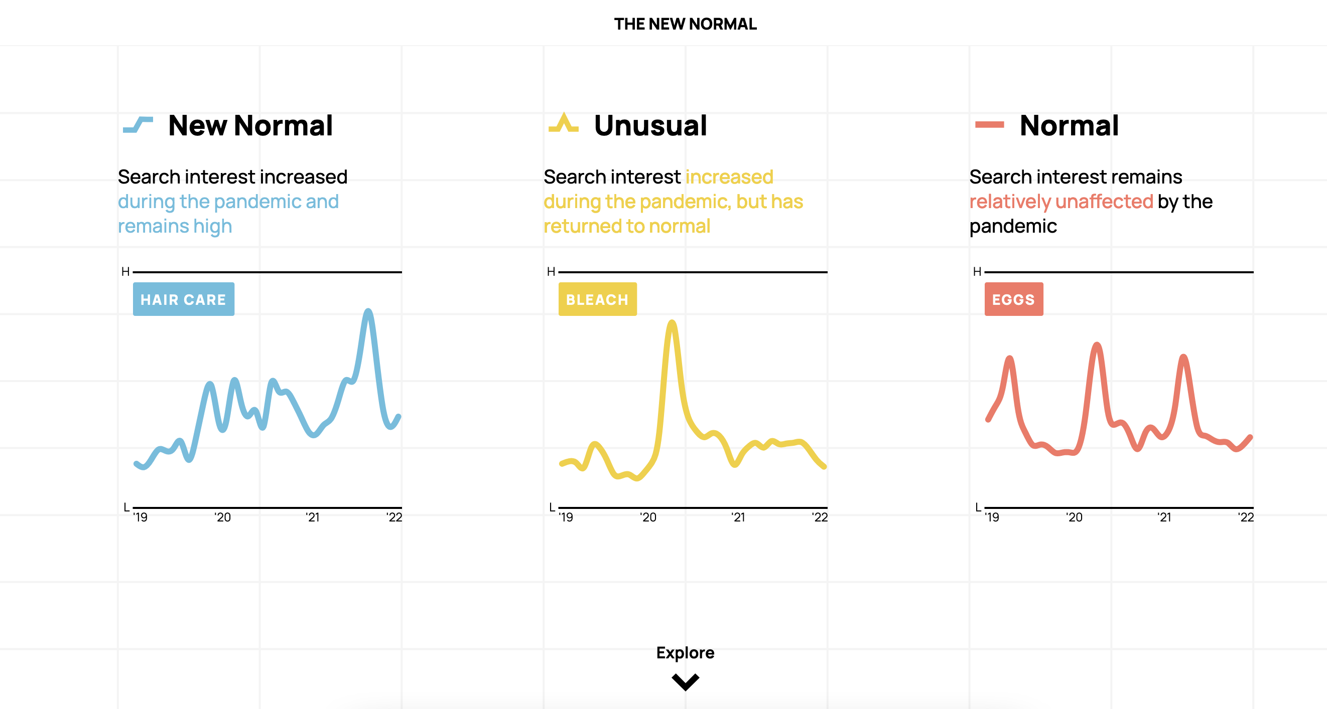
A collaborative piece between Schema Design, Google Trends, Axios, and Alberto Cairo , “The New Normal” attempts to frame Google Search terms for shopping products during Covid-19 into three new categories shown above. The design and implementation of the charts feels very elegant and approachable, though I do wonder how true the “framing” of each search term will turn out to be (“skin care” is the new normal?). Interesting all the same.
Learn
We are so excited to announce Plot Cheatsheets - an interactive overview with printable PDFs to explore each of the foundational concepts of the Observable Plot library including: Marks, Scales, Transforms, Layout & Colors
— Observable (@observablehq) 7:49 PM ∙ Jan 24, 2022
observablehq.com/@observablehq/…
Observable Plot Cheatsheets
Last year, I started using Observable notebooks as my go-to method of exploring data quickly. Their plotting library, Plot, is easy and intuitive to use—it takes the wonkiness out of D3 and allows you to focus more on customizing the plot through a simple dictionary. They just released a series of interactive cheatsheets that makes it even easier to get started. Added it to my bookmarks.


