
Data to know for COP26
What to tell the kids, the climate stakes of COP26, and a text portrait with CSS

A short issue this week!
There is one phrase that sums up the state of climate change progress ahead of (and at time of writing, during) COP26:
Yes, we have made progress. No, it is not nearly enough to avoid a global crisis.
Today, I offer a few pieces of writing and data visualization to illustrate this point.
Read this
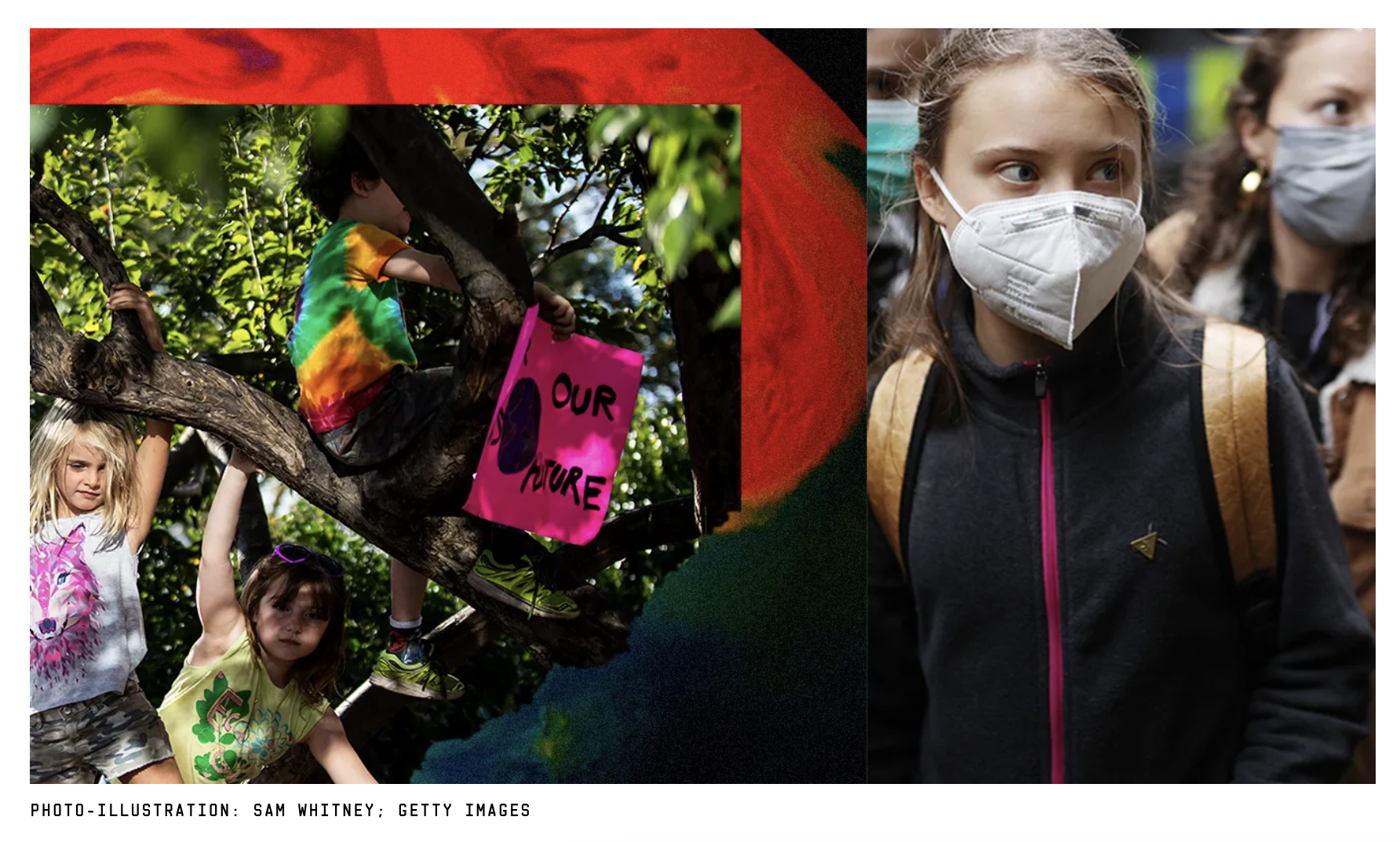
Stop Telling Kids They’ll Die From Climate Change
In a recent survey of young people on climate change, more than half agreed with the statement “humanity was doomed”. Kids love a good hyperbole, but as author and Our World in Data head researcher Hannah Ritchie points out, this attitude can lead to a alarming sort of self-fulfilling prophecy: If we’re all doomed, why try?
As a climate activist, I am in fact deeply sympathetic to this feeling of hopelessness. It’s called climate anxiety. But I also want our young people to continue fighting, as we fight alongside them. Our situation is deeply serious; but it calls for action, not inaction (which is tempting when you feel there is no hope). Hannah introduces a level of nuance and data to this tension that is well worth a read.
So what do we tell kids?
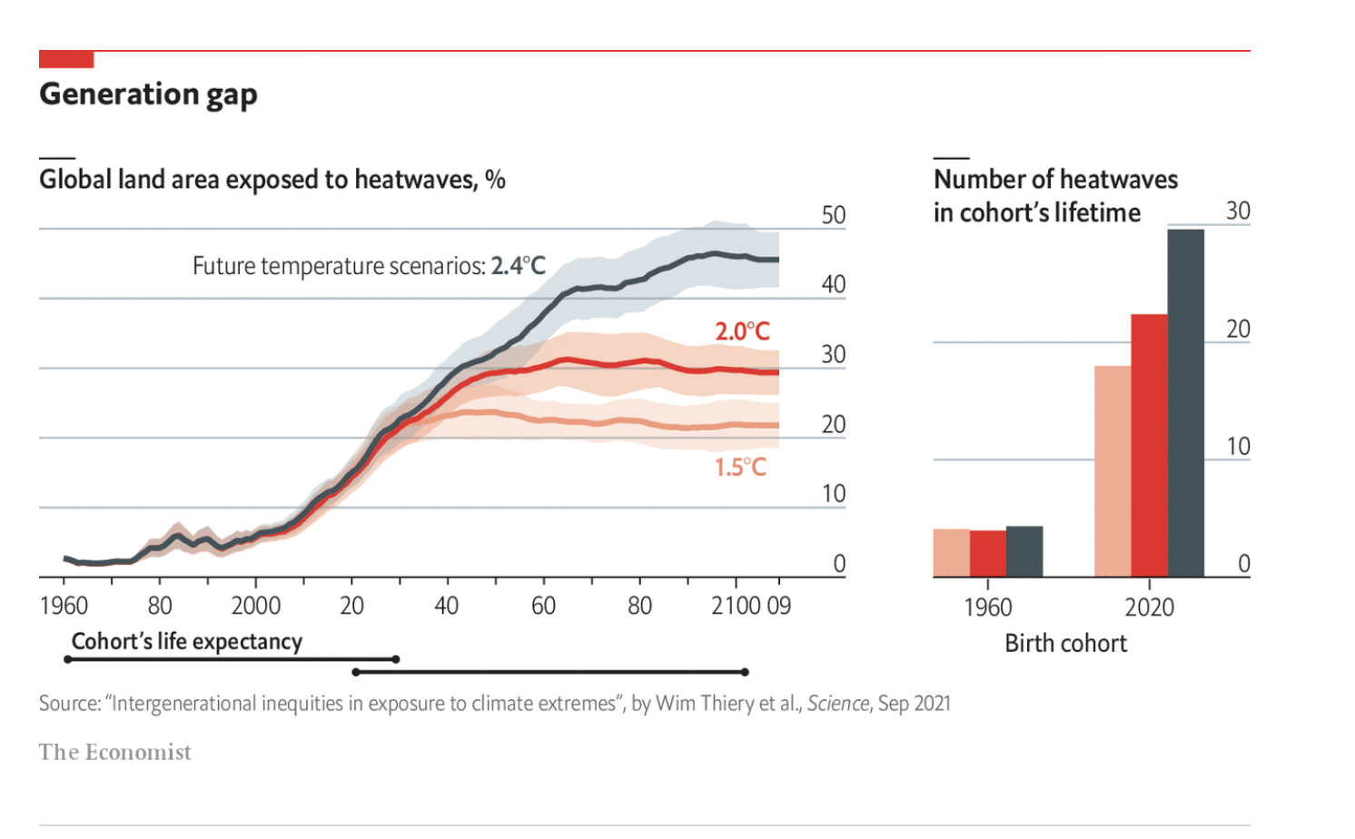
Start with the truth: some things are definitely going to change, and for the worse. Research estimates that children born today are seven times more likely to face extreme weather events than there grandparents did. Then follow it with hope: we can always fight for a less bad future. That may sound like a grim kind of shot-chaser, but when it comes to the climate, every degree counts. The difference between 1.5 and 2.0 and 2.4 degrees Celsius of warming will literally translate to lives saved or lives lost.
Explore
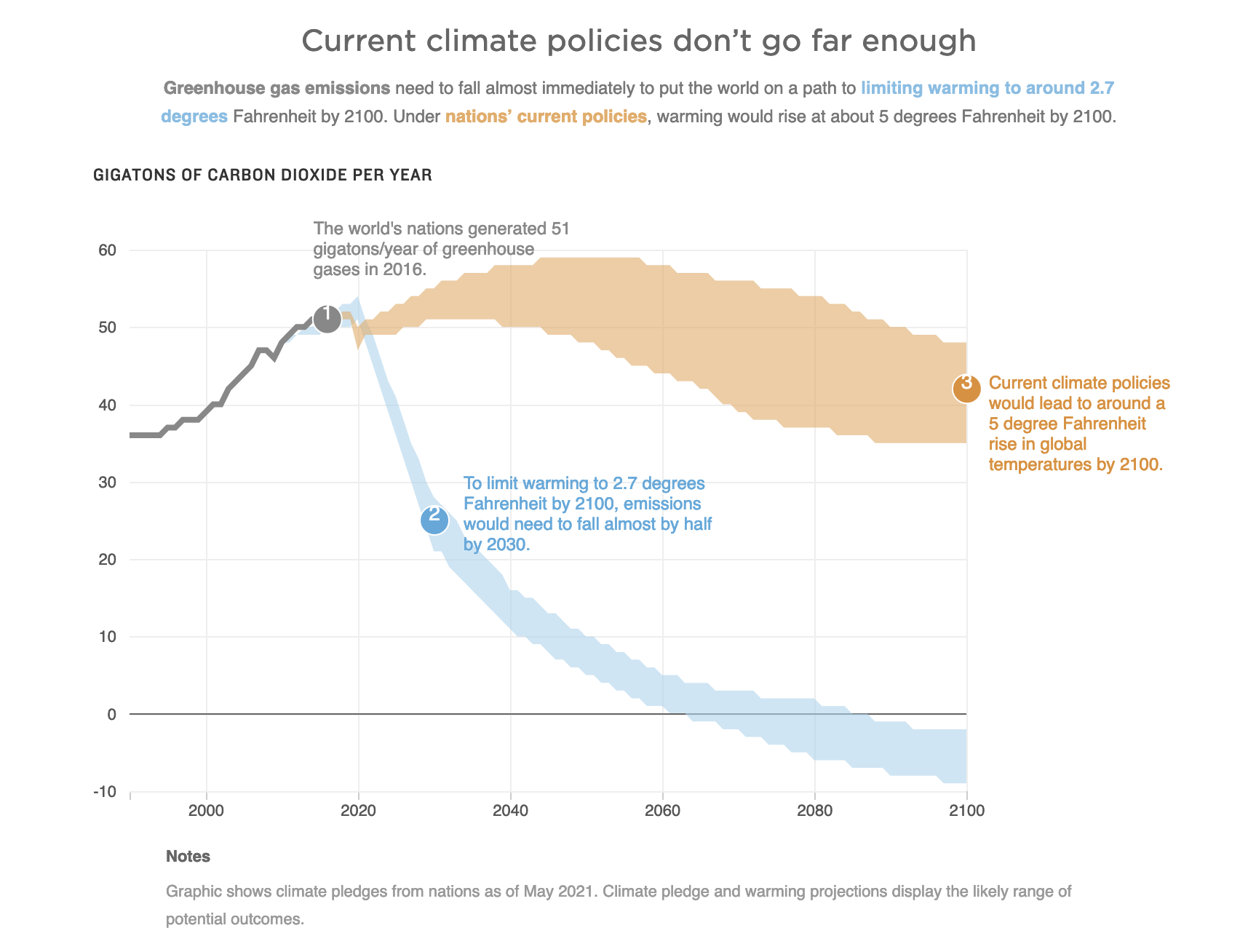
These 4 charts explain why the stakes are so high at the U.N. climate summit
It’s in the title. NPR Graphics breaks down the data that shows just how high the stakes are for our collective future. The shaded confidence intervals and annotations on these charts are particularly helpful I think. Are current “best efforts”, if we even follow through, will lead to a world that has warmed by 5 degrees F by the end of the century.
Found while scrolling
COP26 will likely see big hype around renewables. But data shows that Big Oil isn’t putting the money where their mouth is:
The idea that Big Oil is prioritizing investments in renewables is perhaps their biggest lie — and one we’re going to hear over and over at this hearing.
— Jamie Henn (@jamieclimate) 3:15 PM ∙ Oct 28, 2021
Here’s what their capital expenditures looked like in 2019.
#SlipperySix
A nice redesign of the NYT Sankey diagram showing future pathways. This one has color stripes to show the warming at each year:
A striped version of the latest NYT front page viz, showing what progress has been made and how awful lot there is still to do at COP 26 right now.
— Alex is declustering crises (@alxrdk) 12:14 AM ∙ Nov 3, 2021
Something to learn (not climate related, but pretty cool)
CSS Tip 💡
— Pratham (@Prathkum) 5:43 AM ∙ Nov 1, 2021
You can create text portrait using 2 lines of CSS.
Code👇 Output👇


