
Data visualization as grief
A new Data Curious format, the road ahead, and reflecting on visualizing grief

Hey
Don’t worry, it’s still me (Ben) and you’re still reading Data Curious, a newsletter about data visualizaiton, information design, and creative development. But you may notice the newsletter has taken a new format.
Housekeeping
Over the holidays I decided to move everything from Mailchimp to Substack. Please know that I have no current plans to “monetize” this newsletter: it’s not about that. I just got tired of wrestling with Mailchimp’s maddening email template UI every single time and I like that Substack takes care of all that fiddly stuff for you.
Substack let’s you leave comments too! So hopefully that makes it easier to start some conversations. Let me know what you think…
Some reflections
I’ve been writing this newsletter for more or less 4 years now. It started as a weekly blog series on Medium, morphed into a weekly newsletter on Mailchimp, and then became a weekly-ish (ok, sometimes more like montly) roundup of cool data visualization things I found on the internet.
I am a serial cataloger of things, so I save links all the time. My hope was that sharing these links with you all would give back in some small way.
Lately though, I’ve had some second thoughts. Am I still the best person to do this? To be totally honest, anyone with a Twitter account and a few hours of free time each week could aggregate most of these links.
I don’t have an answer yet. This newsletter was never meant to be a formal thing, and certainly never a stressful one. So just posing the question. I have heard from readers that they really enjoy discovering new projects/tutorials/libraries through the newsletter, so I think this will certainly continue. But I also like the idea of focusing more on topics for each newsletter, and diving deep into a small area (accesibility in data viz, for example), rather than maintaining a loosely categorized, steady stream of inspiration. Isn’t that what Twitter lists and Pinterest boards are for after all?
Anyways, enough rambling: leave any thoughts you have in a comment!
Visualizing grief
Finally, before we get to some links (something to Read // Explore // Learn), I wanted to share some background an article that I just published through Nightingale, journal of the Data Visualization Society.
Over the past few months, I have been thinking a lot about the role that data visualization is playing in the COVID-19 pandemic. Much like election seasons, data viz has once again come into the mainstream. There has been some incredible and innovative visualization work from journalists, scientists, and developers trying to educate the public on this deadly virus.
But at the same time, part of me can’t help but wonder if we are missing an opportunity. One that is less obsessed with numerical accuracy, precision, and encodings. An emotional opportunity.

I think as people who practice data visualization, we can often assume that if the visualization is clear enough, if we are smart enough about things like data-to-ink-ratios, descriptive chart titles, and data annotations, then readers will understand the message. And if they understand the message, they will be convinced of its importance.
But as I started to look into the psychology of storytelling, my suspicions were confirmed: this is simply not how humans work most of the time.
We are, to make up a word, story-creatures. Some psychologists estimate we are 22 times more likely to remember a fact in it’s “storied” form.
So this piece explores the implication of that claim. It also questions how we think about and visualize data around death, illness, and loss.
But if I’m honest, this article was more personal than that. I do think that data visualization can benefit from taking more evocative approaches to storytelling, drawing inspiration from art and poetry and music. At the same time, I’ve been personally looking for places to put my grief.
Grief of this kind is a hard thing to describe. I have been lucky; no one that I know personally, or am close to, has been killed or seriously harmed by COVID-19. This grief felt less tangible than a personal one, more of a collective grief, the presence of a weight that refuses to get lighter.
Rather than burying them, I’ve been trying to explore these feelings intentionally. And one of the things I have turned to is trying to visualize grief. It was a hard piece to write, but in some ways was cathartic.
That’s all the background I’ll give for now. If you’re interested in this topic, check out the article on Medium (if you subscribe and want to support the Data Viz Society, click here, but if you don’t subscribe and are annoyed by paywalls, here is a friend link).
And now, onto some cool things to spark some inspiration this week.
Read
Data Design and the Autonomous Economy
Interaction designer and the co-founder of Parallel Matthew Falla gave a very interesting interview about the role data design will play in shaping how humans interact with autonomous technologies. He describes the practice of good data design as something that “…should feel like it’s having a conversation with the viewer”.
It’s a short read, but it raises some interesting questions about what role visualization will play in the future:
As machines start to become more aware of the world, and more assertive within it, people need maps for a new terrain.
Explore
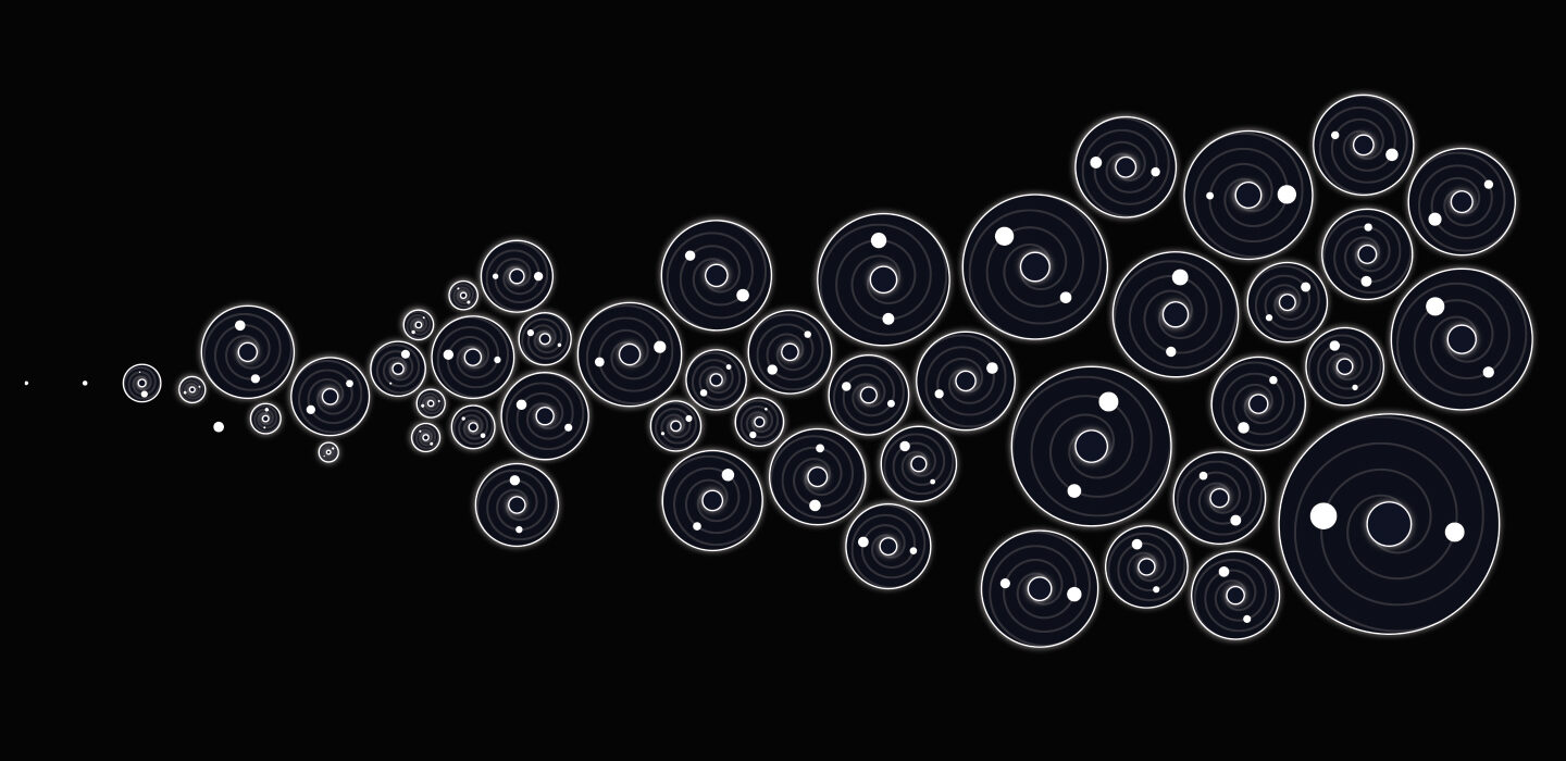
Every gravitational wave event spotted so far
Data viz designer and developer Nadieh Bremer published an interactive piece with Science News that visualizes all detected gravitational events on a timeline. The animations on hover for each event are amazing and the entire timeline packs in a lot of information.
But perhaps best of all, for waveforms with data available, she includes an audio signal of the merger event! Very cool.
If you aren’t familiar with Nadieh’s work, I highly recommend reading this profile and then following her on Twitter.
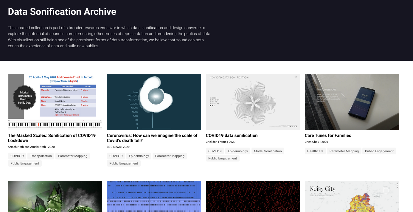
Data Sonification Archive
Speaking of data-turned-to-sound, I stumbled upon this data sonification archive while doing some research for a new piece I’m pitching. It’s a great resource for anyone who wants to explore turning data into sound, with some incredible examples and a few tools to help you do it.
If you’re looking for more on this sonification topic (sounds like it could be a whole newsletter topic?), Duncan Geere and Miriam Quick have started a whole podcast abou it called Loud Numbers (release date TBD).
Learn
This week I’ve got a what a few of what I’m calling “small but deceptively useful” dev tricks that I discovered the past few weeks. The name is terrible, but I’ll think of something better next time.
- this GIF finally helped me understand Flexbox CSS alignment. Finally.
- I’ve been using Vue.js consistently for over a year now, and only recently learned you can use it just like jQuery: throw it in a script tag and borrow it’s greatest features for any project. No build step required.
- jq is a lightweight command-line JSON processor, which I discovered to be absurdly useful when filtering huge GEOJSON files (or any big JSON for that matter). If you haven’t used it, check out these no-frills tutorials here and here.
See ya
That’s all for the first issue of 2021. If you have any thoughts, drop a comment!


