
End of Year Lists
What the data behind Spotify Wrapped can and cannot tell us about ourselves

Hello,
It’s been a few weeks. I’m popping back in for a short, and final, Data Curious of 2021. A mini-letter, if you will. But first, some thoughts on year-end lists.
The season of Spotify Wrapped has now come and gone, but the spirit of "let me look back on what I listened to this year" is still upon me. What struck me about my "wrapped" playlist was, in fact, how little I resonated with some of the songs. And not just because I share my account with my partner (although that does contribute).
What is a Spotify Wrapped in the end? It’s a database. It’s the end sums of your timeseries listening data. It’s what Spotify thinks about you.
People share their “wrapped” playlist as a fun way to look back on what you listened to, but also to share a piece of them. Of who they are. But I wonder if that’s actually true.
There’s a difference between who I am, and who Spotify thinks I am. And that difference lies in the algorithm. My Spotify Wrapped was not so much a collection of my favorite albums, pieces of music that moved me. It was more a “vibe”. A reflection of how many people listen to music these days; a radio station in the background, more ambient noise than engaged appreciation.
The passive experience is nice, but doesn't stick with me emotionally at all. And I think it has real implications for the way that we view the data and algorithms that rule our online selves. Number of listens can be informative, but seems a crude and incomplete metric to use across the board.
So I wanted to reflect on the albums that really made a big impact on me this year, whether or not the number of times I played it on Spotify says so. Quantity is only one metric, and often not the most useful one when your listening experience is driven by an algorithm.
Reflecting on music led to reflecting on my favorite podcast episodes, films, books, and more from 2021. So I decided to do all of them! You can find my entire, totally subjective and non-quantitative list of “Top Fives” (arbitrary number) at this note in my digital garden.
I enjoyed the excercise of looking back in a subjective, qualitative way so much that I’d like to make it a yearly practice.
And now, as promised, a very short sampling of data-related things. I will be retreating from the internet and offline (mostly) until 2022.
Read
Introducing a novel approach to 3d UMAP visualization for single cell genomic analysis
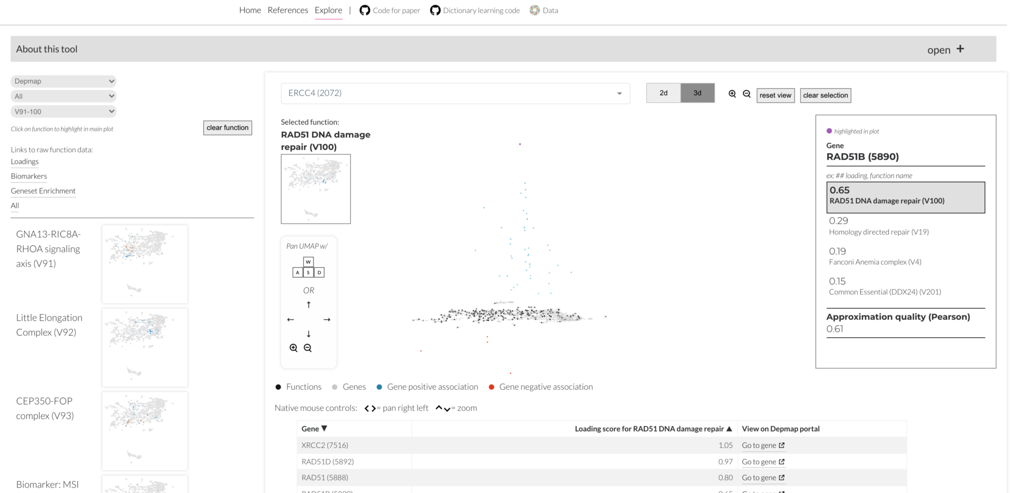
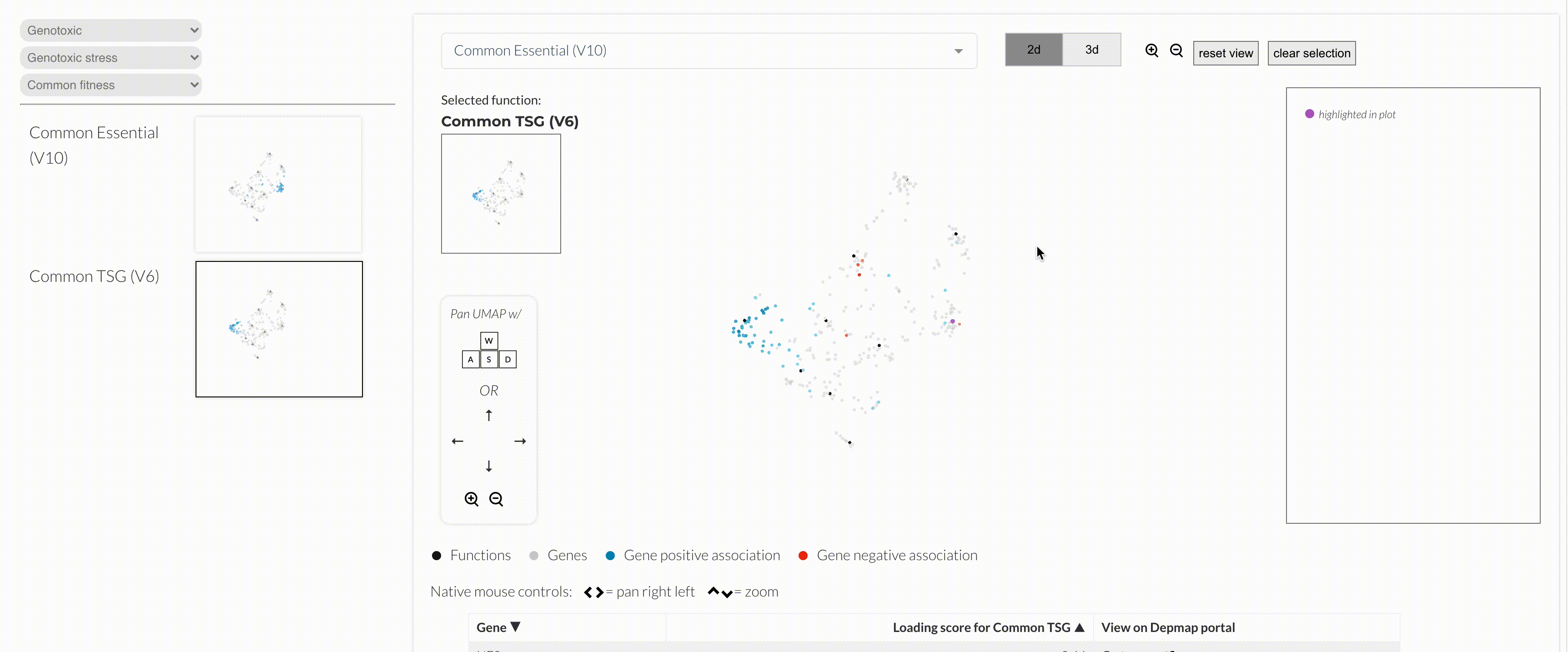
A few weeks ago, I wrote about a new visualization prototype that I created at work. You can read all about it at this blog post, but basically, it is a new attempt at making 3d UMAPs less awkward and clunky to navigate. Oh, and it does this cool flippy thing!
Explore
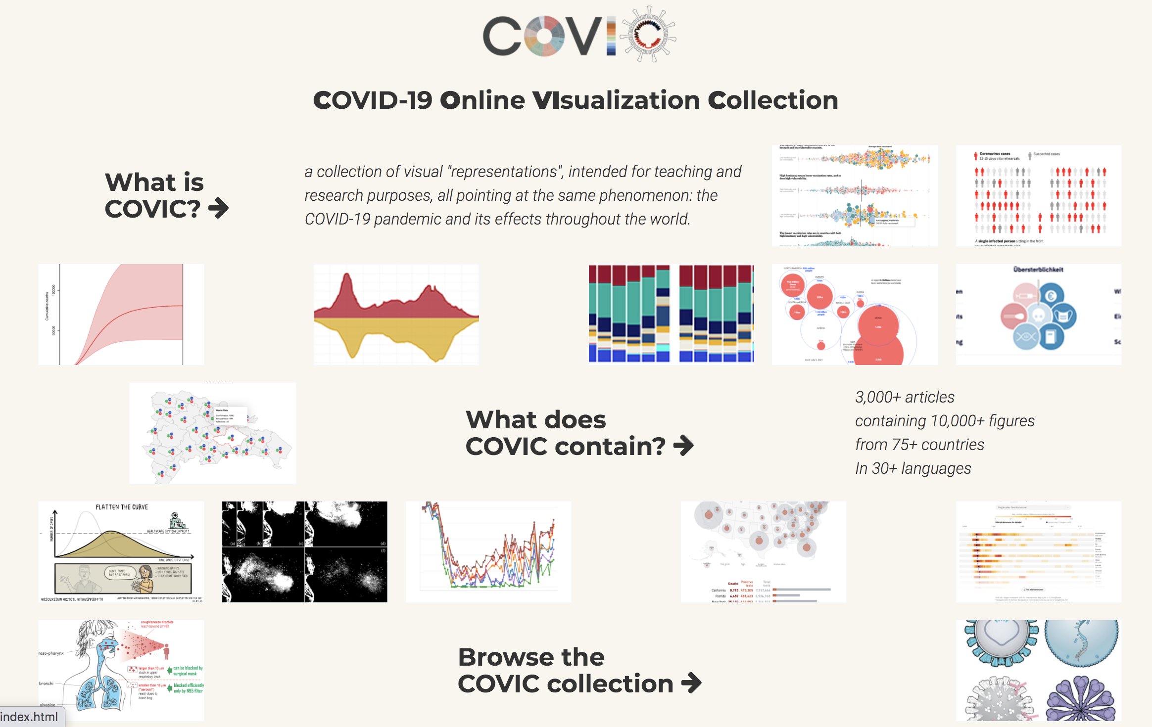
An Online Collection of COVID-19 Visualizations
What a treasure trove for visualization researchers. The archive classifies articles and figures in a format that is available for teaching and research purposes, and it creates a comprehensive snapshot of how we visualized the emerging pandemic. Incredible resource to bookmark if you work in this space.
Learn
Ok, so here is the portion where I usually share something code related. But I thought this also fit nicely as a stellar example on how to create a cohesive design system using data visualization. Giorgia Lupi is an absolute masterclass at this, so you can learn a lot by taking a look at her case study with the Gates Foundation below.
Proud to share the work we’ve been doing for the @gatesfoundation in the past months!
— Giorgia Lupi (@giorgialupi) 5:26 PM ∙ Dec 13, 2021
We designed and developed a new data visualization brand system to help tell rigorous, branded, and above all human stories about gender equality 👉🏼
pentagram.com/work/gender-eq…
@pentagram


