Finding our senses

Hello,
One edition into my new platform host (Ghost) and everything is smooth sailing so far. Thanks to those who signed up recently on the new landing page. The old Substack is officially deleted, so you will no longer find my posts there (the archive has been migrated here).
This week I'm thinking a lot about limitations. Specifically, the limitations that our screen devices offer. So much of visualization, and the web in general, has adapted (perhaps capitulated is a better word) to the demands of our devices.
But I think we lose something when we default to the same old methods of conveying information over and over. In the name of "best practice" and "user experience", I fear we have lost what made the internet weird and wonderful in the first place.
Amelia Wattenberger, a creative developer I have long admired, writes about this wonderfully in her blog "Our interfaces have lost their senses". It's my favorite thing I have read about design in a while, and the first recommendation in this edition of Data Curious.
Further down I revisit an expansive, truly multi-modal data experience about London's Covid lockdowns. And I also nerd out a bit on my latest geometric obsession: L-systems.
Hope you enjoy.
Read

Our interfaces have lost their senses
In this piece, Amelia wonderfully recaps the history of computer interfaces. There's a clear through-line to how we got here—relying on typing text or scrolling as our sole ways of interacting with a device. But what have we lost by simplifying and standardizing our every online experience?
Here's my favorite bit:
"We've been successfully removing all friction from our apps — think about how effortless it is to scroll through a social feed. But is that what we want? Compare the feeling of doomscrolling to kneading dough, playing an instrument, sketching... these take effort, but they're also deeply satisfying. When you strip away too much friction, meaning and satisfaction go with it."
Read the whole piece (and marvel at those adorable fabric figures).
Explore
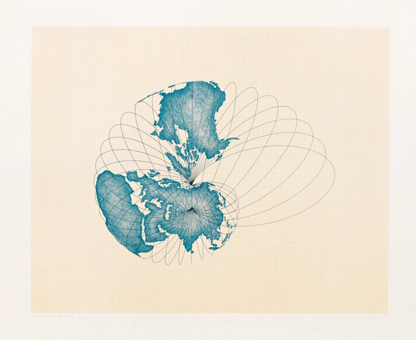
London Under the Microscope
Five years ago, many countries around the world implemented lockdown policies to combat the spread of Covid-19. Data designer Valentina D'Efilippo commemorated this milestone by revisiting her piece "London Under the Microscope", an immersive visualization, sonification, and physical exhibit telling the story of 9 million Londoner's under lockdown.
The piece is now a permanent part of the Museum of London archive. A dedicated team worked to turn mounds of Covid data into something more human, and more embodied, than the ubiquitous spike maps and case curve charts. Special mention to my friend Duncan Geere, who was responsible for the data sonification, which really brings the whole piece to life.
In this post, Valentina shares some of the background, as well as a few slides which explain the team's process. You can watch the full video above. More and more, these are the pieces that stick with me and that I want to explore more in this publication, and it resonated closely with the spirit of Amelia's article above.
Learn
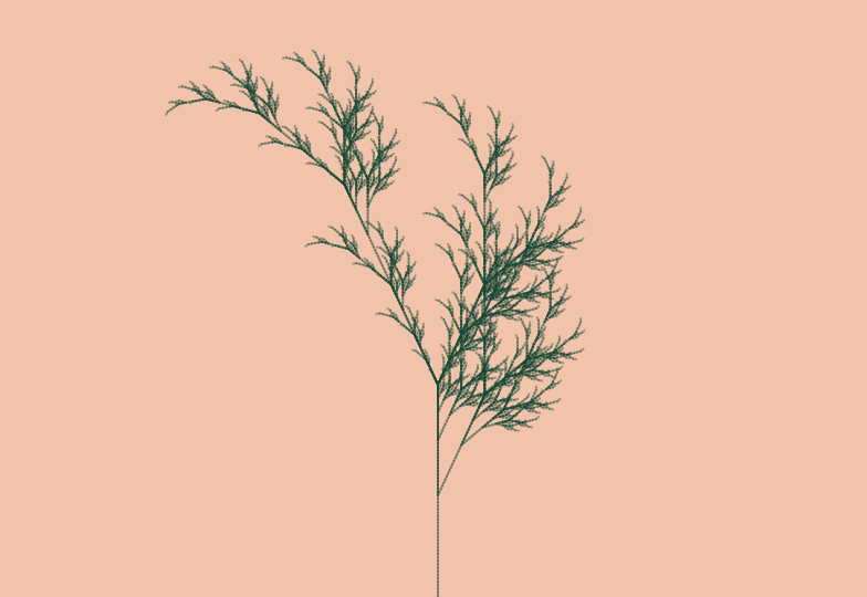
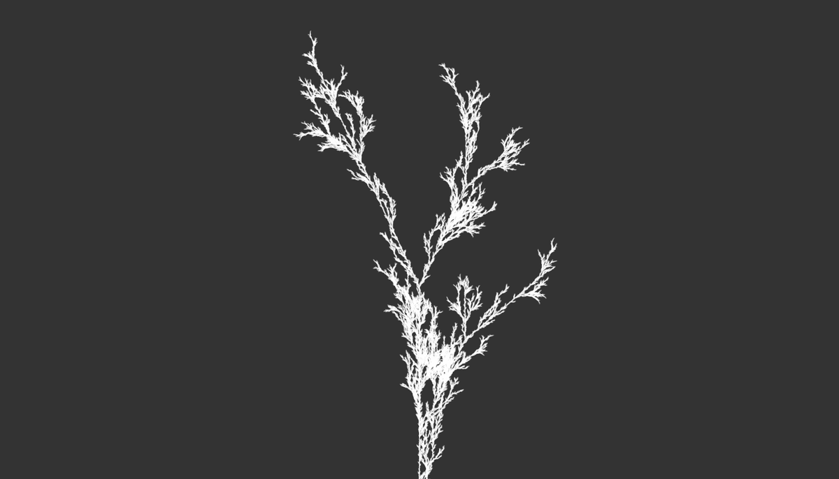
Lindenmayer systems (L-systems)
I'm starting a new visualization project at work which has lots of different data types: structured, unstructured, hierarchical, time-series, and network. The possibilities feel somewhat endless, both a blessing and a curse. The other day, when I was trawling for inspiration, I stumbled upon an old technique that has sparked my curiosity as potential reference: L-systems.
If you're unfamiliar, here's a simple definition from Wikipedia:
"An L-system or Lindenmayer system is a parallel rewriting system and a type of formal grammar. An L-system consists of an alphabet of symbols that can be used to make strings, a collection of production rules that expand each symbol into some larger string of symbols, an initial "axiom" string from which to begin construction, and a mechanism for translating the generated strings into geometric structures."
L-systems are also a kind of fractal pattern, which means that a set of rules defines how a shape repeats over and over. Fractal patterns are everywhere in nature, like the spiraling of seeds in a sunflower, or ice crystals, or broccoli florets.
They are quite beautiful to look at on their own. But I'm interested in their capacity to carry and convey information, so I've been brushing up on some old tutorials I found long ago. The first is from the legend himself Daniel Shiffman (who I have long thought of as the Mr. Rogers of teaching code). He breaks down fractals in simple terms, and a working code snippet for the p5.js code can be found in the Youtube description.
Falling further down the rabbit hole, I discovered another tutorial video from "Barney Codes" on how to introduce some randomness to L-system plant generation. Again, p5.js code snippets found in the description.
I expect there will be more to come on this topic as I get further into the project. For now, two other resources on L-systems which I have saved for later:
- an L-systems generator web app, which helps you wrap your head around how tweaking parameters will update the pattern in real time
- another cool L-systems generator site, which focuses more on pre-defined patterns, some of which were brand new to me
Until next time,
Ben