
Making maps for humans
An exploration of how geospatial angles and treatments affect how we see the world

Welcome back to Data Curious. This issue focuses a lot on geospatial mapping and theory, so if you’re into maps, let me tell you this one is a treat.
Many people love maps, but very few actually understand them. Maps are supposed to reflect the natural world around us, but in reality, almost every type of projection falls short in some way.
If you’ve watched The West Wing, you know what I’m talking about. If you haven’t, take three minutes to treat yourself below to Allison Janney and Bradley Whitford getting schooled by a bunch of geographers on the subtle deceptions of the Mercator projection (or if you prefer to read something instead, this article is a good introduction).
Maps are great for communicating information, but they also can distort significance and power by making certain coutnries, landmarks, and regions larger than the rest. As a data visualization designer, it’s important to think about the implications of the projections and angles that we use to convey geographic information. That’s basically what this issue is about.
First, a quick follow-up
I wanted to start this week’s edition with a brief follow up to my last post Data Visualization as Grief. Since last week’s edition (and the blog post I wrote that inspired it), I have noticed all sorts of other visualization methods pop up around me seeking to answer the same question: how do we quantify the massive loss of life due to COVID-19?
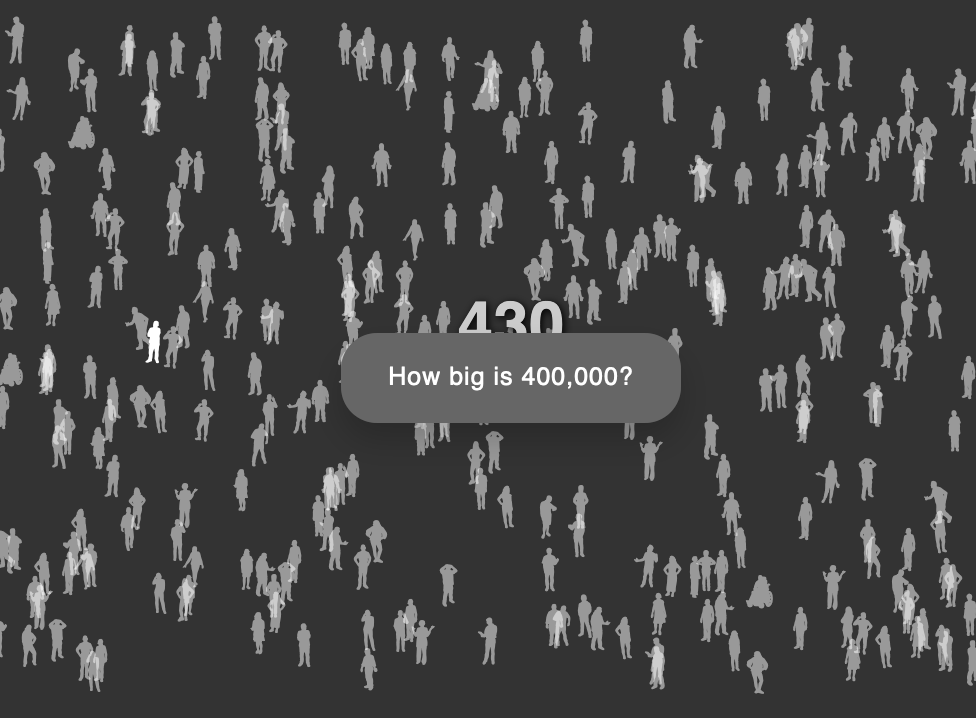
Two stood out as worth mentioning. One comes from data artist Kristin Henry, with an experimental animation titled “How big is 400,000?”. The piece uses ProPublica’s open source WeePeople font as a way to better humanize each life lost. I found watching the animation both sobering and mesmerizing.
The next is from the NYT. Similar to my WebGL-based dot viz, this piece represents each life lost as a single dot on the page. Interestingly, the dots are positioned on a vertical time axis as you scroll, which gives a sense of change. Annotations throughout mark significant milestones of the pandemic in America.
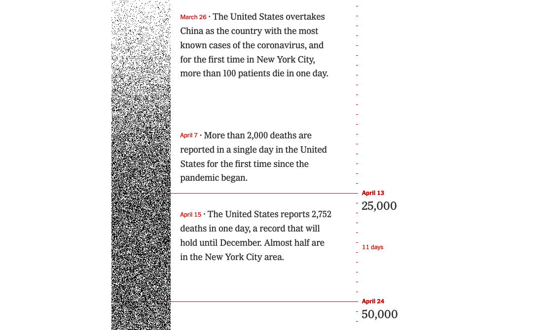
Essentially, this approach takes the “curve chart” we’ve all come to know and dread, and instead uses the density of dots to represent increases in the rate of death. A subtle design choice, but for me, it feels completely different even though the data is the same. If you relax your eyes, the dots almost feel like they are vibrating.
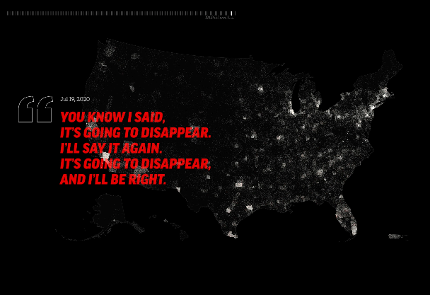
Update post-publishing: After sharing this newsletter, Matthias Stahl brought my attention to another relevant piece that I wanted to include for the archive: Trump's Year of COVID: 365 days of denial, disinformation, and death . I really loved the combination of quotes overlaid on the map of dots, with music that was syncrhonized to the speed of the animation as time passed.
Current trends suggest that, for now, the U.S. may be turning a corner on coronavirus cases and deaths. Even still, we will continue to need these alternative methods of visualizing such a massive loss of human life as a way of reckoning with what is, and what could have been.
Read
For those of you interested in maps, geospatial analysis, and/or remote sensing: prepare to get nerdy for a minute.
I loved this deep dive into nadir and off-nadir satelite imagery by Robert Simmon. For the unintiated, Simmon explains the way that nadir (top-down, birds-eye-view) imagery leaves a gap in understanding:
Lacking many of the cues we use to interpret the world around us, top-down satellite imagery (often called nadir imagery in remote sensing jargon) appears unnaturally flat. It’s a view that is disconnected from our everyday experience.
By contrast, off-nadir (or, slightly from the side) views connect deeper with human experience. When we go for a hike on a mountain, we are seeing the landscape from this off-nadir view. When we walk down a street, we are looking at buildings and landmarks from an angle.
Visualizing data from this more familiar angle can have big impact on our understanding of things like wildfires, landslides, and floods. Simmon’s makes the connection from the abstract to the practical in this way:
The connection between what we see from the familiar ground-level viewpoint and the novel, top-down perspective of a satellite view is what makes oblique imagery so powerful. Likewise, presenting new information in the context of pre-existing knowledge is an essential element in successfully communicating unfamiliar ideas. In both science communication and data visualization, it is essential to use the familiar to build a bridge to the novel.
At the very least, you should read this article for the beautiful satelite images. But the whole thing rules. Checkout the full story here: Earth at a Cute Angle.
Unrelated, but timely
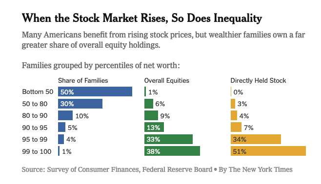
With the flurry of Gamestop/Wall Street news over the past week, I thought it relevant to make a plug for this piece even though it doesn’t relate to maps. To understand the unfolding drama, you really need to ask one question: who owns the stocks?
If, like me, you’ve been perplexed on days when a news report includes items like “record coronavirus deaths” along with “stock market surges”, this provides some context.
Explore
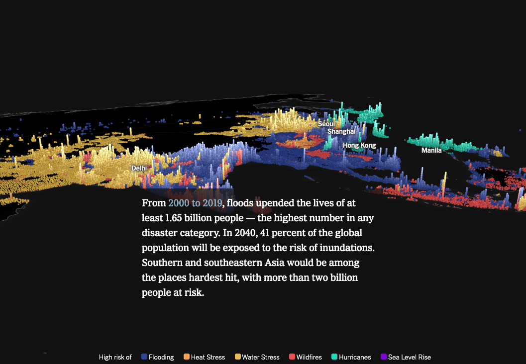
In its own way, this story from the NYT uses this angle technique in a quite frankly groundbreaking (from a dev perspective, at least) story on the global risks of climate change. As you scroll through the piece, the change in angle from nadir to a more tilted, 3d-ish angle gives you a sense of perspective and location on the map. The shaded columns representing risk levels for each type of natural disaster stand out acutely against the dark background map.
Food for thought
Within the geospatial community, there is a constant tension between the human association of size = importance. Our eyes are naturally drawn to larger shapes first. This presents a tricky problem in data visualization, especially when you want to draw attention to specific countries while still preserving the projection of a full world map.
The below approach is one example of the many ways folks are trying to get creative about striking this balance. Personally, I’m into it. The goal of this map (a vaccine tracker) is not really about the shape of the country. This is just a contextual clue. So in an editorial decision, they left it out. Unconventional, but effective.
Check out this interesting cartography decision! Very small countries are depicted with circle symbols instead of their actual geometry (and colored according to the overall choropleth palette) so they can be seen.
— Gretchen Peterson (@PetersonGIS) 8:53 PM ∙ Jan 27, 2021
-Bloomberg's vaccine tracker
For fellow programmers, I wanted to include another unconventional approach that caught my eye (especially if you use Svelte). Data viz developer Amelia Wattenberger released her latest “Svelte recipe” with an interesting twist: when on mobile, the map dynamically switches from a flat projection into two stacked globes, showing opposite sides of the world. I found this delightfully original and thought-provoking. Mobile screens are tiny, so why use the same map you would on a desktop?
🥓🥞 new Svelte recipe 🥞🥓
— Amelia Wattenberger (@Wattenberger) 1:24 PM ∙ Jan 29, 2021
Here's the Svelte code I use to start a world map - each country has a bubble whose size & color can be hooked up to a data variable
but I mostly wanted to share my fav way to handle maps on mobile: with two stacked spheres!
svelte.recipes/components/wor…
Learn
Both links for “something to learn” this week take the form of Observable notebooks. Neither of them are specifically map-realted, but I like them anyways, so here ya go.
I’ve been discovering more and more tutorials through browsing Observable, and I must say, it rocks. The ability to write Markdown alongside interactive code snippets makes it so much easier to explain programming concepts.
The first item is a new open source package from Twitter for making high-dimensional density plots. The parameters for customization look very flexible. You can even make a time-series density plot, which looks interesting. Excited to play around with it next time I get a huge dataset to viz.
Next is a “data doodle template” from designer/developer Shirley Wu. I really love this idea. Shirely brilliantly documents the design process of someone in this line of work by going from data manipulation to visualization. And because it’s an Observable notebook, you can change any of the parameters of the code for yourself along the way!
That’s all I got
If you saw any interesting map treatments recently, drop a comment!


