On data art
Summer has flown by. Conference season (for me) has now come to an end, and I'm thinking about new projects for the coming academic year. The newsletter took a seasonal hiatus, but feel ready to dive back into a semi-routine of publishing.
I had the chance to attend two very different conferences: the very first Data | Art Symposium in Cambridge, MA, and also the annual World Journalism Education Congress in San Francisco. Very different audiences and motivations, but both creatively stimulating.
After a few weeks brewing, I wanted to share some thoughts on the data art conference, what stood out to me, challenging examples, etc.
I am in no position to define this evolving field, but I'll do my best to share some observations from the various speakers. A few highlights from my note on how to think about data through this lense:
- Data as artistic medium, like pigment, paint, marble.
- Data as capta (Drucker) - something taken, not given
- Data as revelation - visualizing the imperceptible
- Data as critique - how does it expose power?
- Data as poetics - evolving language reflecting cultural beliefs
In this newsletter, I'll share some of my favorite examples from the speakers that illustrate the above points. One of my biggest takeaways was that data art has a fundamentally different motivation than data visualization.
Data visualization treats the data as final and inert, aiming to explain, highlight, or amplify a certain message. In contrast, data art often turns the lense back on the data itself to think critically about its generation, capture, consumption, and power dynamics.
It does not seek to simplify with a clear answer or action. It seeks to question.
Today I'll depart slightly from the typical "something to read/explore/learn" format and just focus on highlighting the work that challenged my conceptions most in this area. I hope you enjoy it as much as I did, and if you have any ideas about what might/might not be data art, let me know in a reply!
Library of Missing Datasets
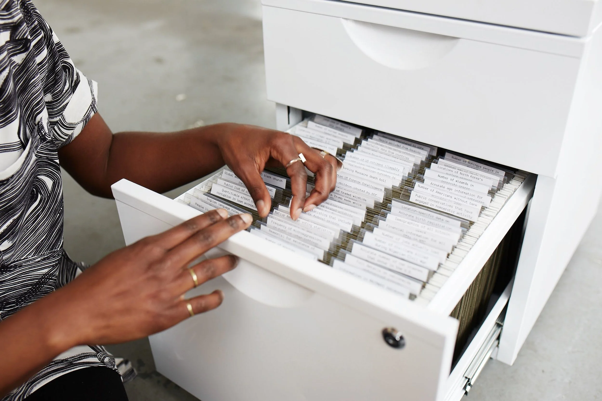
Created by Mimi Onuoha, the Library of Missing Datasets challenges our conception of the data we collect by highlighting the data we don't collect. Large white file cabinets were filled with empty folios of missing datasets, like "People excluded from public housing because of criminal records" or "Mobility for older adults with physical disabilities or cognitive impairment".
What does this say about what we value as a society? What does this say about the limitations of quantiative measurement? You don't come away with answers; you come away with questions.
Climate Crisis Font
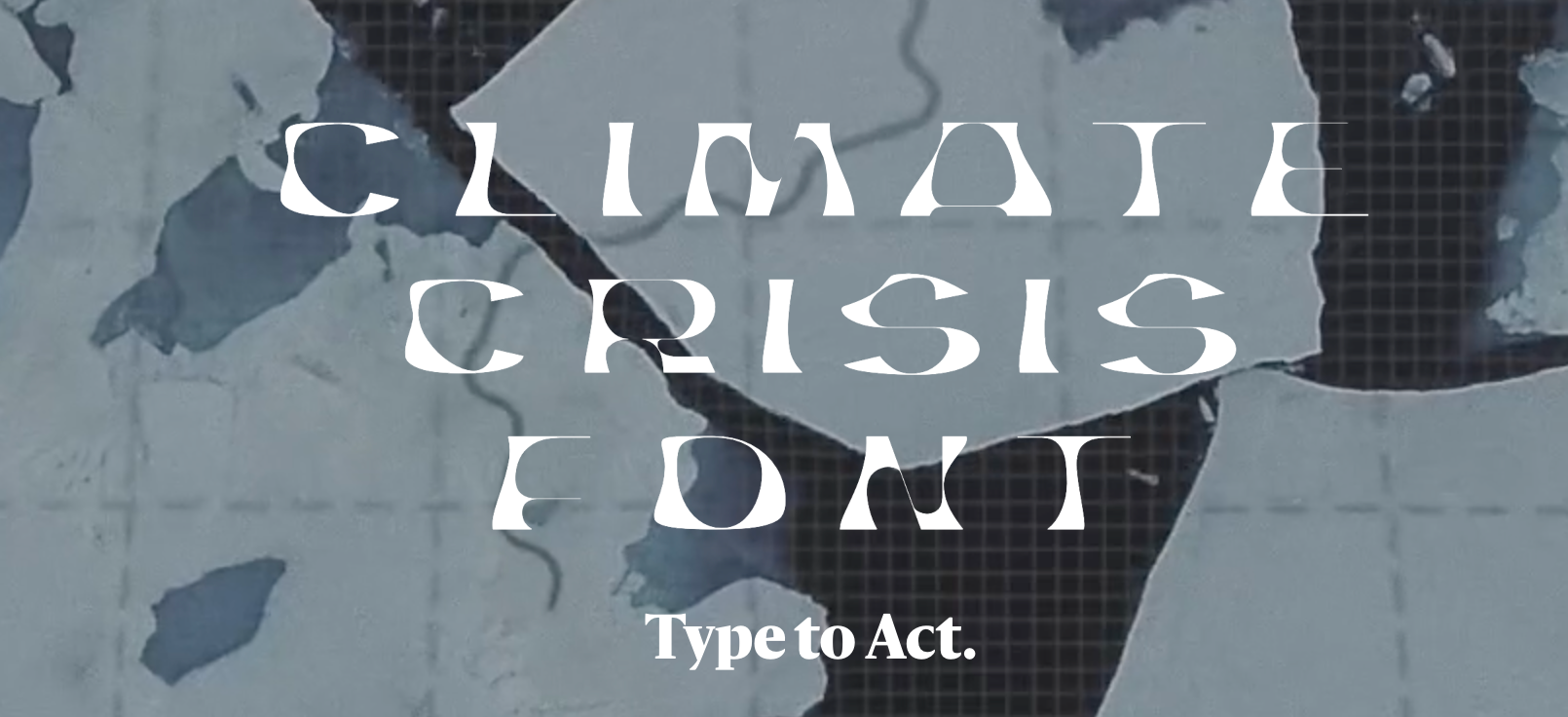
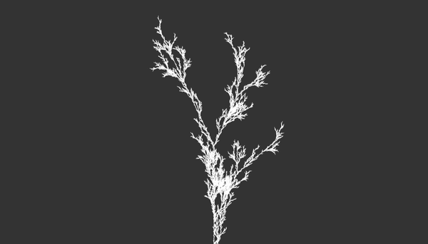
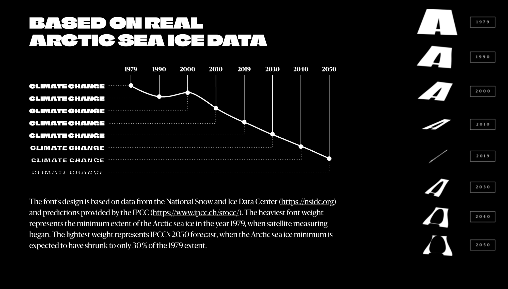
The Climate Crisis Font is a freely available variable font (meaning it has a smoothly scaled range of weight values). The weight of each letter corresponds to data from the National Snow and Ice Data Center and predictions provided by the IPCC.
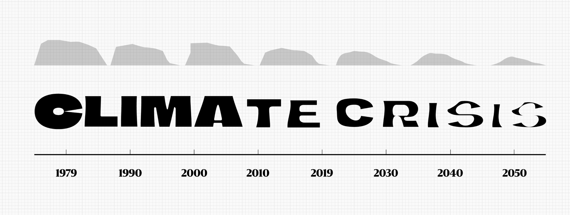
"The heaviest font weight represents the minimum extent of the Arctic sea ice in the year 1979, when satellite measuring began. The lightest weight represents IPCC’s 2050 forecast, when the Arctic sea ice minimum is expected to have shrunk to only 30 % of the 1979 extent."
I found this simple yet brilliant. A living font, something that changes based on data that is being tracked each year. Imagine an online magazine that gets harder and harder to read as the letters disappear. We have so many ways to obfuscate and ignore the impacts of climate change. This project uses data to make ignoring it harder.
Capture
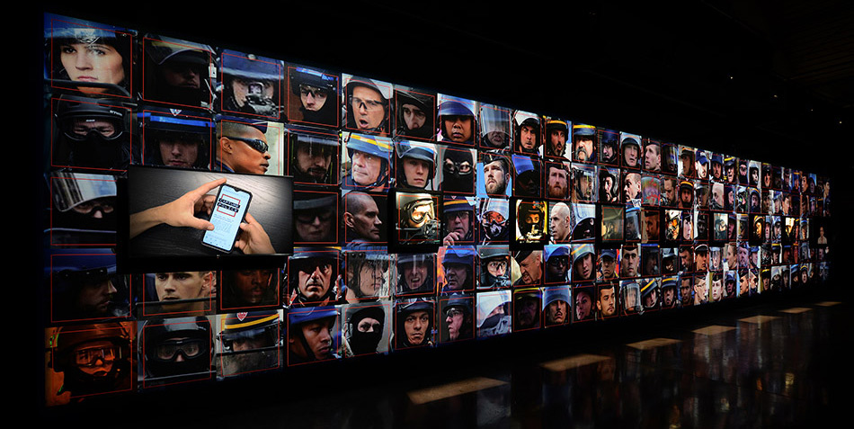
Capture turns the turns the technology of facial recognition back onto one its primary users: the police. Artist Paolo Cirio collected 1000 public images of police in photos taken during protests in France. He then used facial recognition software to create an online database of officers. At its core, Capture was created examine " the potential uses and misuses of Facial Recognition and Artificial Intelligence by questioning the asymmetry of power at play".
The project inevitably led to lawsuits, cease-and-desists, and general outrage from French government.
Again, the motivation is in the question: who gets to use facial recognition? Who gets to be identified without their consent? Who is this data for and about?
Land Music
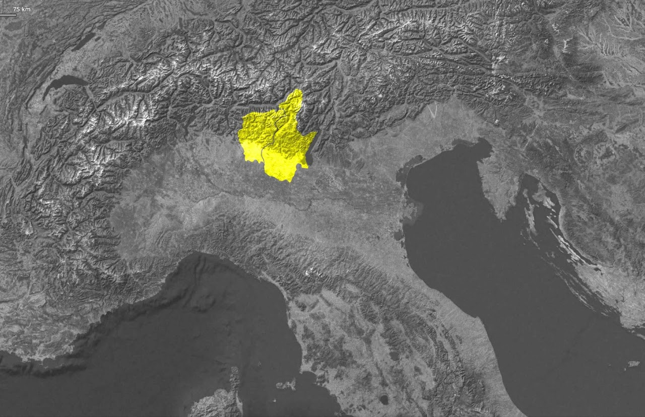
I was so touched by this piece created by Nessun Dharma, an artist duo made up of Matteo Bonera and Michele Zuccarelli Gennasi. Land Music was a distributed data sonification of the lives lost during COVID-19 in Bergamo, Italy. The size and scope of the project (see below) cuts through what is often called "compassion fatigure", or in this case data fatigue. Maybe to comprehend what it means to lose (in this part of the world) tens of thousands of lives, we need an artwork that is similar in size and scale. Excerpt on the project below:
"Land Music is a territory-specific data-driven performance created for Bergamo Brescia Capitale Italiana della Cultura 2023. It consists in making all the bell towers present on the over 7,500km2 of territory simultaneously concerted; resulting in the spatially largest concert ever performed.
It transformed the entire area of Bergamo and Brescia into a resonating data-sonification soundscape. Land Music was held on March 18, 2023, the National Day of Remembrance for the victims of COVID-19 in Italy.
At exactly 8:00 PM, each bell tower in the participating provinces tolled a number of chimes corresponding to the number of COVID-19 victims in the parishes and municipalities to which they belonged. The +13,000 chimes resonated across the region and created a deeply symbolic "extended concert" that united the provinces of Bergamo and Brescia in a shared act of remembrance and solidarity. This powerful soundscape turned the physical landscape into an auditory experience for the attending communities."
I highly encourage reading more about the project and watching the video at their website: https://www.nessundharma.com/landmusic
Four Epochs of Paradise
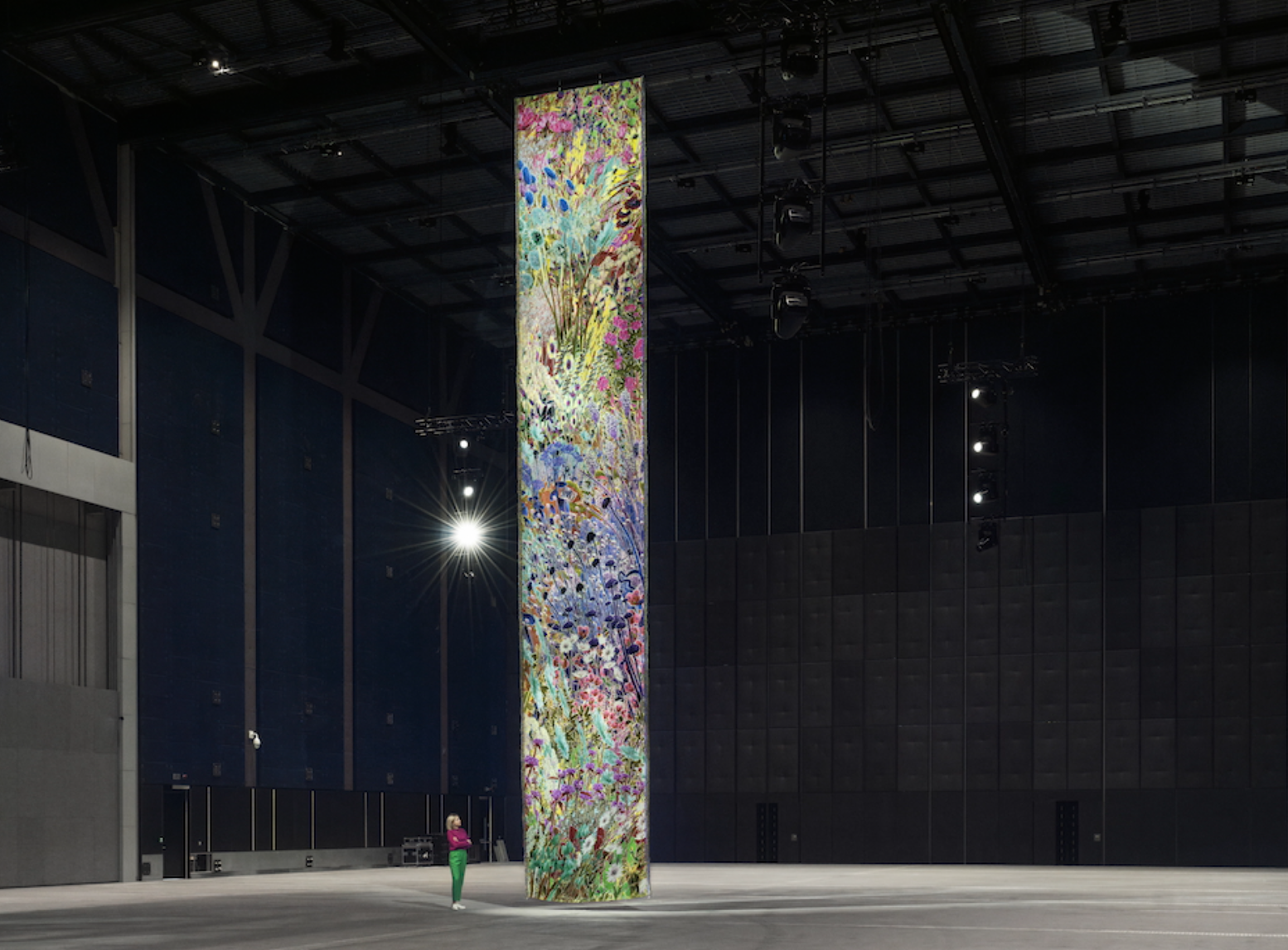
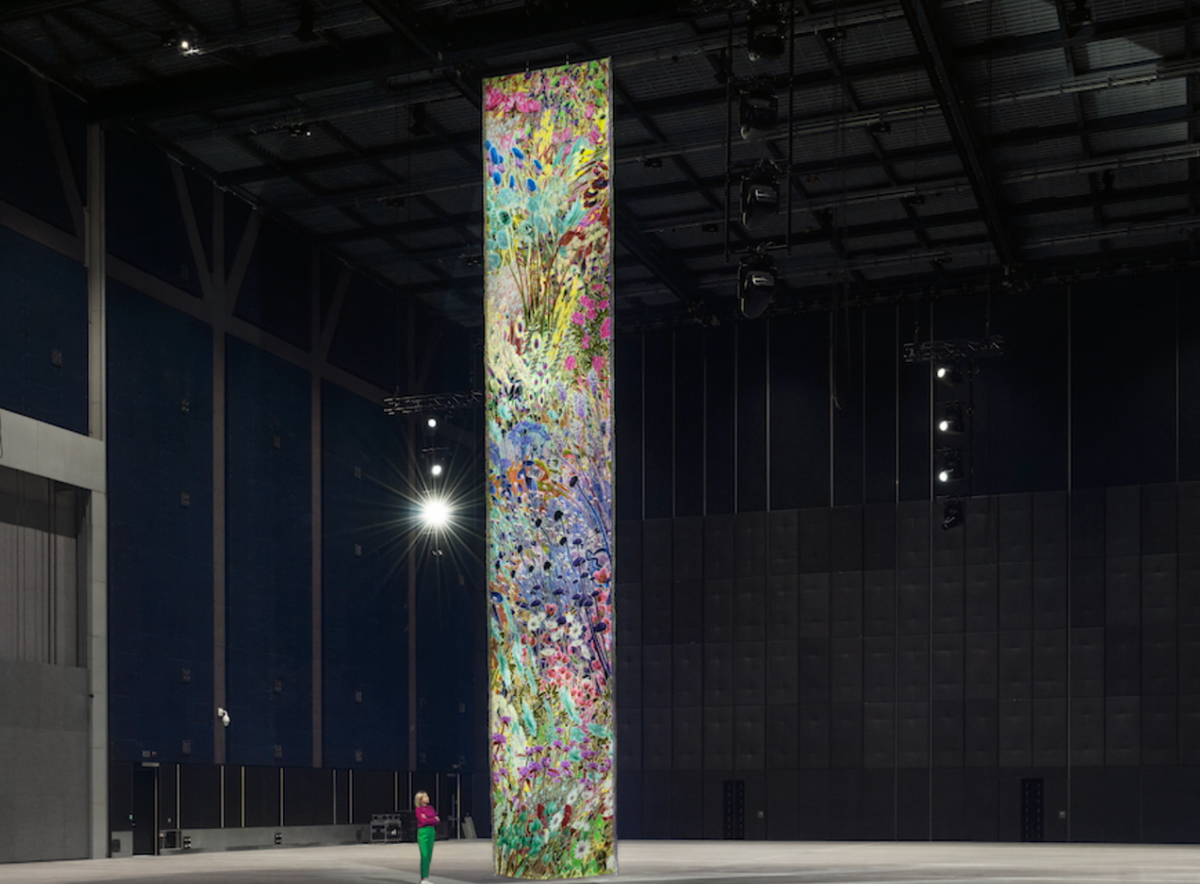
Artist Alexandra Daisy Ginsberg's piece shrinks humans to the scale of an insect—the 14 meter long double-sided tapestry shows a garden from two perspectives. One shows how a human sees the colors, while the other how an insect would see them. Unsurprisingly, the "insect side" looks completely different than the human.
As a home gardener, I find myself constantly pointing out to friends the extreme anthropomorphism we apply to our landscapes, designing everything for human eyes and enjoyment with non-native and exotic plants. What would our gardens look like if we designed them for insects? This tapestry gives a glimpse.
The above projects were a mere snippet of the challenging work presented at the conference. I wish my notes were better, otherwise I would have included more!
Finally, as a bit of homework, I added this book to my reading list: Critical Visualization: Rethinking the Representation of Data by Peter Hall and Patricio Dávila. Feels like it will fit well alongside Jer Thorp's wonderful Living in Data or Dietmar Offenhuber's Autographic Design.
If you have any other similar books you could recommend, hit reply and let me know!


