
Probable Futures
Data story genres, an MRI of the Earth, and Google Sheet databases

Frontmatter
On more personal digital spaces
With all the recent Musk-buying-Twitter-for-free-speech nonsense, I’ve been staying off Twitter (my only remaining consistent social media). And the break has prompted some reflection: what is it that I originally liked about it? Twitter used to be the place I followed my friend’s work, discovered interesting stories or visualizations, learned about new projects. Increasingly, it just drains me.
I do still find these things, but in a decidedly old-internet way: emails. To be clear, this is not me touting the genius of Substack (use whatever you want). But I’ve come to collect a small number of newsletters, mostly written by people I know/admire/respect, that I look forward to reading each week. Almost like my own private social feed.
Could social networking move back to individual spaces instead of “public forms”? I hope so. Even though it’s just a fun proof-of-conecpt, one developer I follow spun up his own social network (all code in this repo) in a single day that anyone can subscribe to.
In the same spirit, I’ve been experimenting with ways I can move off of large networks and into smaller, more personal spaces. Email may be un-sexy to some, but it has the benefit of being near universal, device agnostic, and peer-to-peer (mostly).
So, I’m trying to revive an old email list I put together last year. Its original purpose was to promote some music I was putting out, but it kind of morphed into a more general “what I’ve been working on” thing.
These emails will act as virtual postcards. If I make something interesting or new, you might receive a postcard about it. If I have some ideas that I've been eager to talk about with others, possibly a postcard. Significant life/work/existence updates? Postcard. You get it.
I’d like to keep this newsletter you’re reading now fairly focused on a certain type of work and subject matter (even if at times it feels amorphous). For everything else, maybe things that don’t fit as neatly into Data Curious but I’m working on or exploring, there’s my b.dexter postcards.
Now onto some links.
Read
The Genres of Data Stories
I love the simplicity and clarity of this blog post by Will Chase on how to categorize different types of data stories into “genres”. It put into words something I have also noticed over time, that stories using data to explore a concept typically fall into one of four approaches: answer a question, explain how it happened, explain how it works, or show off a bunch of cool data. There may be others, but I feel like these four categories capture so much of what I see online, regardless of the publisher. As someone who has made this kind of story, I can also relate to framing the “genre” as an early step in the process. Check out the full article for some great examples and explanations of each.
Explore
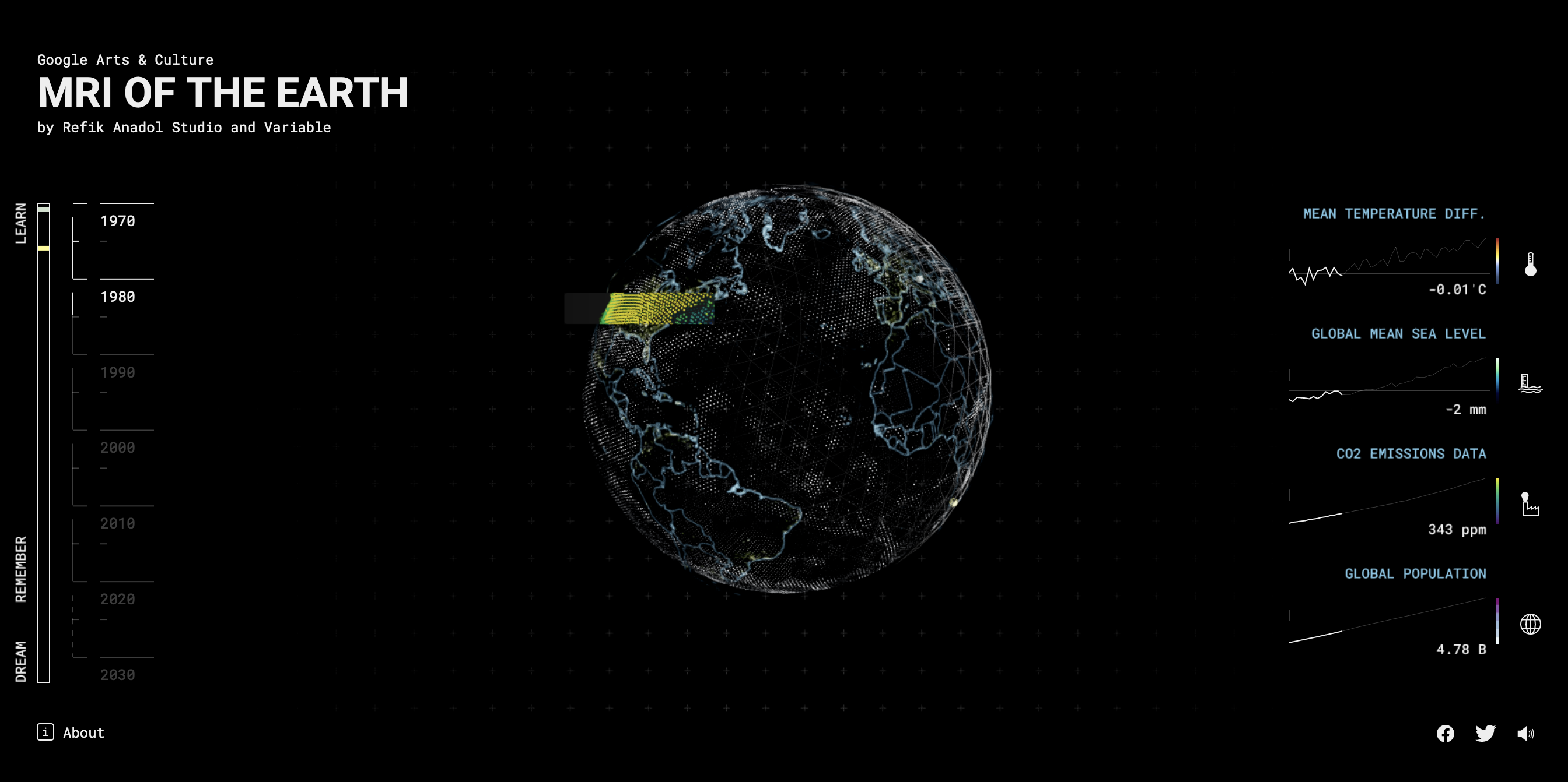
MRI of the Earth
Using the metaphor of a sick patient in need of an MRI, London-based creative studio variable.io created an interactive piece of data art that imagines what Earth’s landscape could look like in a future shaped by climate change. The storytelling in this piece is astounding, combining animation, video, sound design, and data visualization. As the piece progresses, the design and music become more “glitchy” and fragmented, capturing the feeling of fragility in some of Earth’s ecosystems.
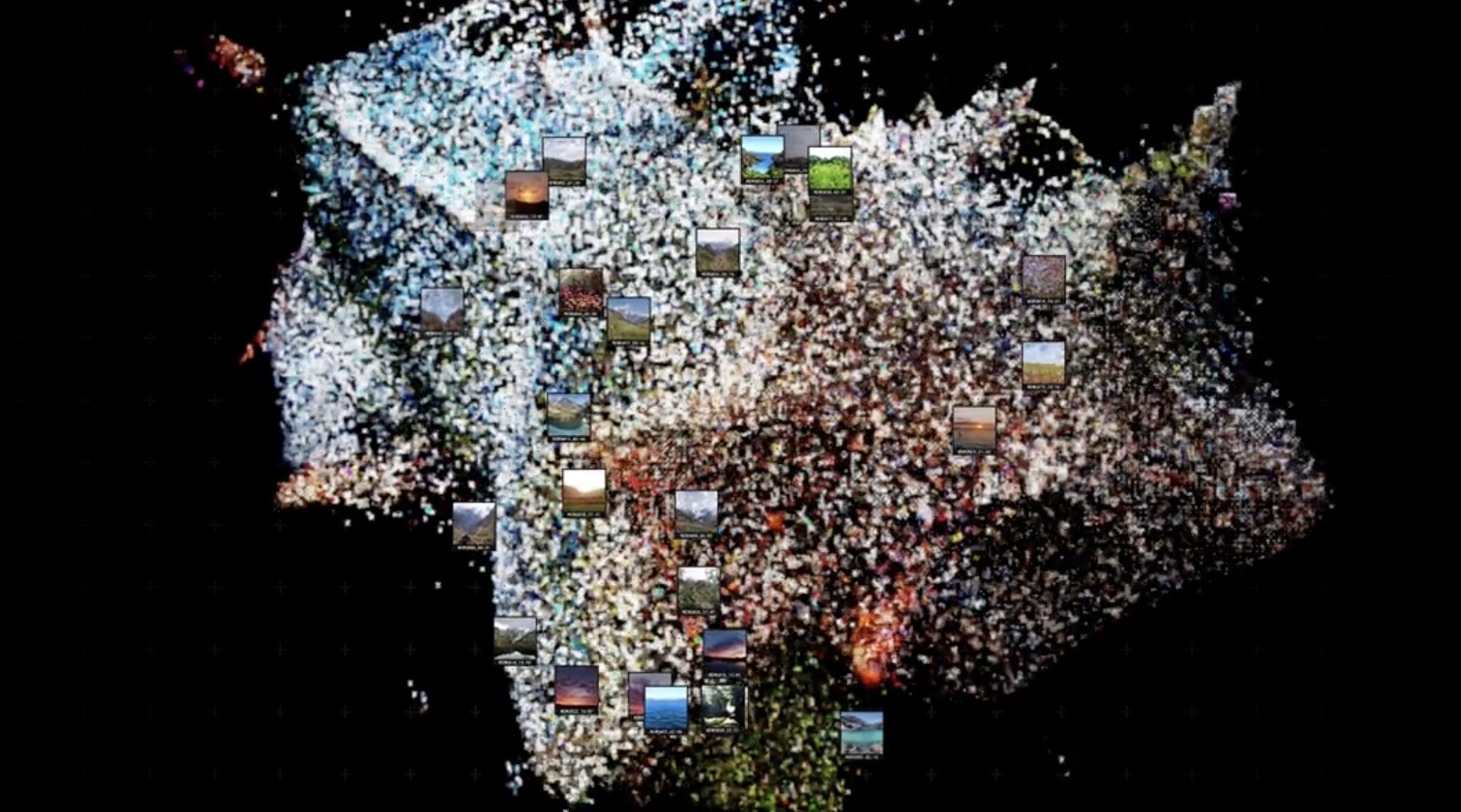
The story even goes so far as to use machine learning to imagine possible futures, combining “over 200 million images to create a collective memory of Earth's natural landscape and used UMAP algorithm to group them by similarity.” These images are then fed into a GAN (generative adversarial network) that "dreams" a myriad of possible landscapes. The effect is haunting and sobering.
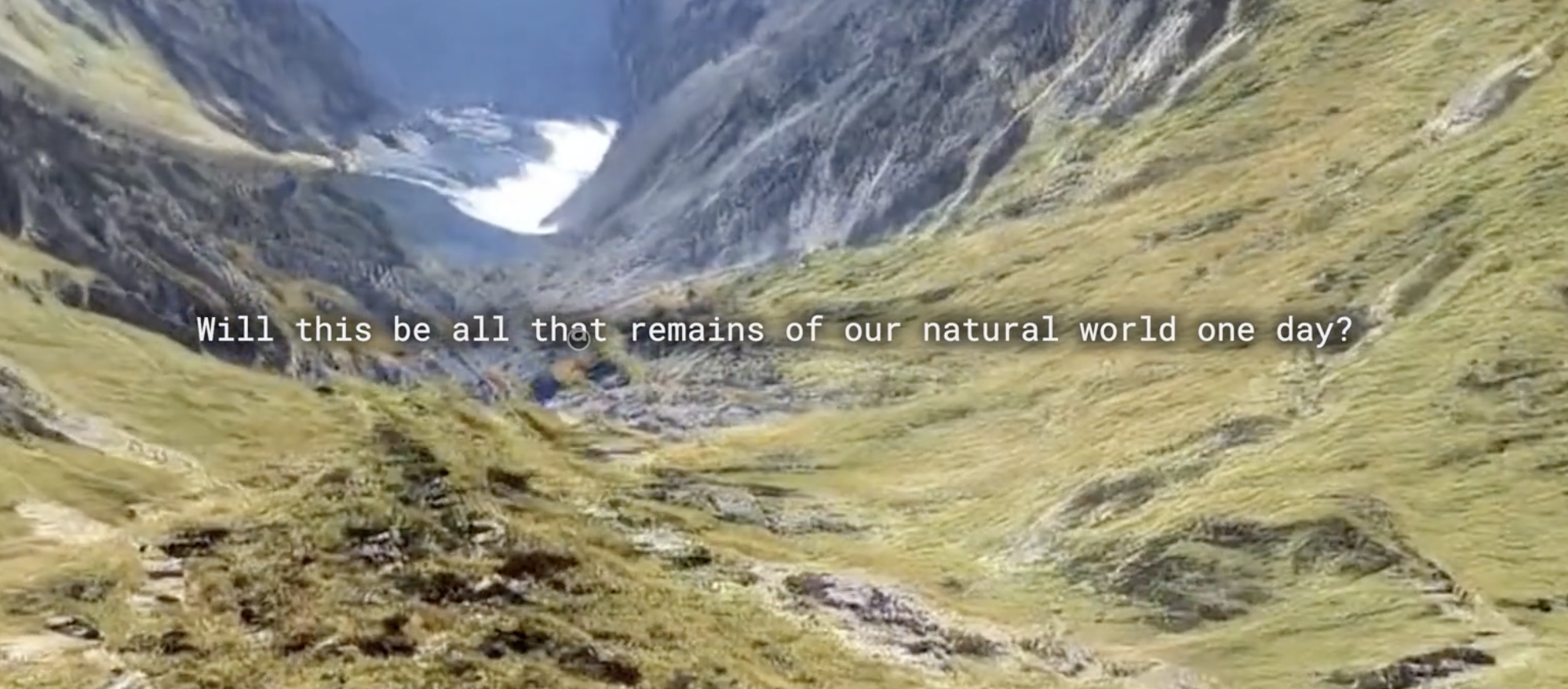
After seeing so many data interactives about climate change online, it’s rare to find one that is as relatable and emotive as this. Read about the creation of the story here or explore the piece for yourself here.
Honorable mention (Explore)
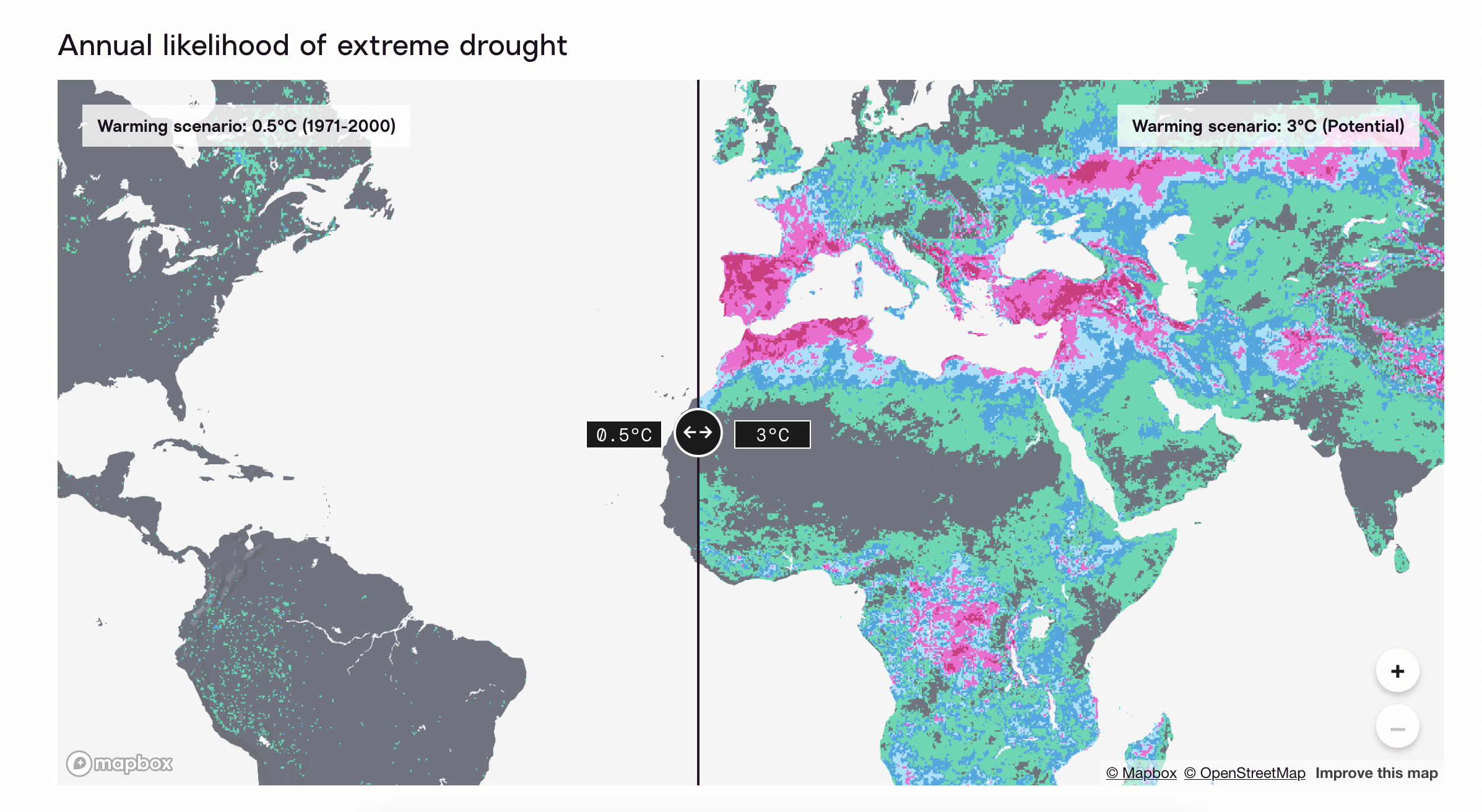
Probable Futures
Speaking of “possible futures”, I also stumbled upon another climate data piece last week called Probable Futures. The site describes itself as aiming to “offer tools to visualize climate change along with stories and insights to help people understand what those changes mean.” The homepage showcases a very clean design, with a few map simulations and key statistics about where climate change is taking us.
But what stood out to me in particular is the tone and approach used throughout: each section of the page considers a warming scenario of 0.5°C, 1.0°C, 1.5°C, 2.0°C, and 3.0°C. So often I see people writing about climate change as a binary—complete disaster and annihilation OR a mild inconvenience. The reality is that there is a huge spectrum in between, a spectrum of “probable” not just “possible” futures. This site does a good job of communicating that visually.
Learn
| |____| |
|   __   |
|  (__)  |
|        |
|________|
Use Google Sheets as a Database
Sometimes you just want to query data from a small database, and not have to worry about setting up an actual database. This tutorial shows you how to use data from a Google Sheet in your website. Adding it as a reminder, because I need to do this for an upcoming project, so could use the refresher myself!


