
Re-learning to learn
Reducing colors in charts, personalized inflation rates, and a visual programming language

Frontmatter
A few weeks ago, I officially wrapped up my first semester teaching at Northeastern University. I found the experience both challenging and refreshing: challenging, in that I had no idea what I was doing; refreshing, in that I got to remember what it felt like to learn something new and build something practical every single class.
After working as a full-time developer for a few years, one thing I have learned is that a majority of my time is not actually writing code. Or if it is writing code, it's debugging, troubleshooting, optimizing, etc. The boring stuff.
Teaching forced me to boil down concepts to their most simple form, and to build simple pages using only HTML, CSS, and Javascript to demonstrate how different data visualizations work. A real breath of fresh air. I hope to find similar chances in the future.
A quick side-note
A few of you signed up for my postcards, which is delightful. I sent out my first postcard today! One quick, relevant note: in my haste, I decided to switch providers (from Buttondown to TinyLetter) *after* sending out last week's Data Curious edition, so if you don't have anything in your inbox right now (from B. Dexter) your email may have been lost in the transfer. You can re-sign up for the actual postcard list here. Sorry for the confusion!
Read
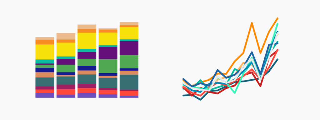
10 ways to use fewer colors in your data visualizations
This piece is a few months old, but worth resurfacing. One of the most common mistakes I see in data viz is using too many colors. Consensus has formed around using somewhere between 6-8 colors in one chart. Although this isn't a hard and fast rule, I try to stick to it, mainly due to accessibility concerns. On top of colorblind considerations, current Web Content Accessibility Guidelines (WCAG) also set a minimum high-contrast ratio of 3:1. What does that mean? That the below colors, though visually distinct enough to some, don't pass if you want low-vision folks to see it:
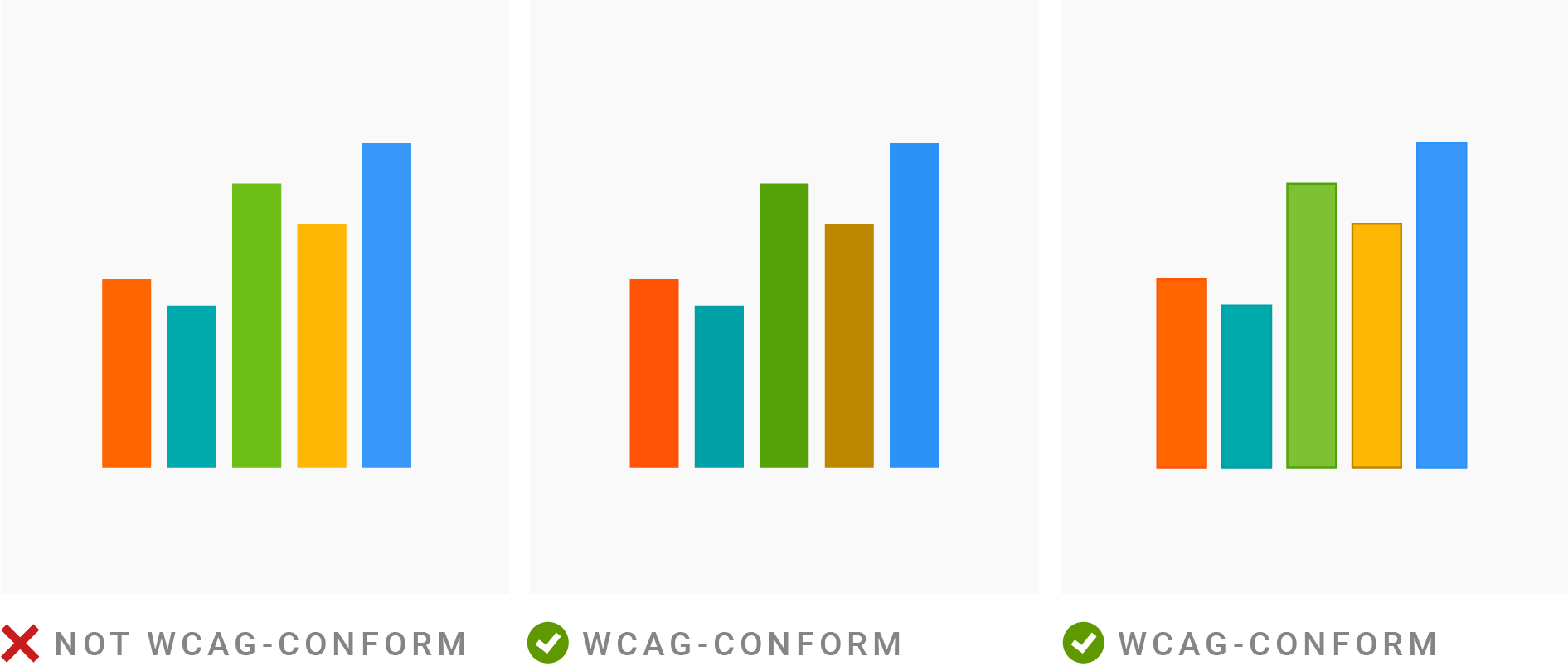
And low-vision emcompasses a lot of people! A 2019 report estimates around 2.2 billion people have some form of visual impairment. It’s more than worth paying attention to.
On top of that, Lisa is a wonderful author and thinker in the data viz design space. She has become the go-to resource on colors for me over the years, and she is even writing an entire book about it. In true open-source spirit, Lisa is writing updates on the book and publishing them on a Notion page as she writes, so you can learn as she does. I love her commitment to sharing knowledge freely.
🟨🟧🟥🟦
— Lisa Charlotte Muth (@lisacmuth) 5:44 PM ∙ Jan 5, 2022
It's happening: I'm writing a *book* on how to use colors in #dataviz 📊!
And you can follow along: Every day, I write an update on my progress – papers I read, color tools I find, questions I have, and people I talk to. Find all updates here: datawrapper.notion.site/Color-Book-Upd…
Explore
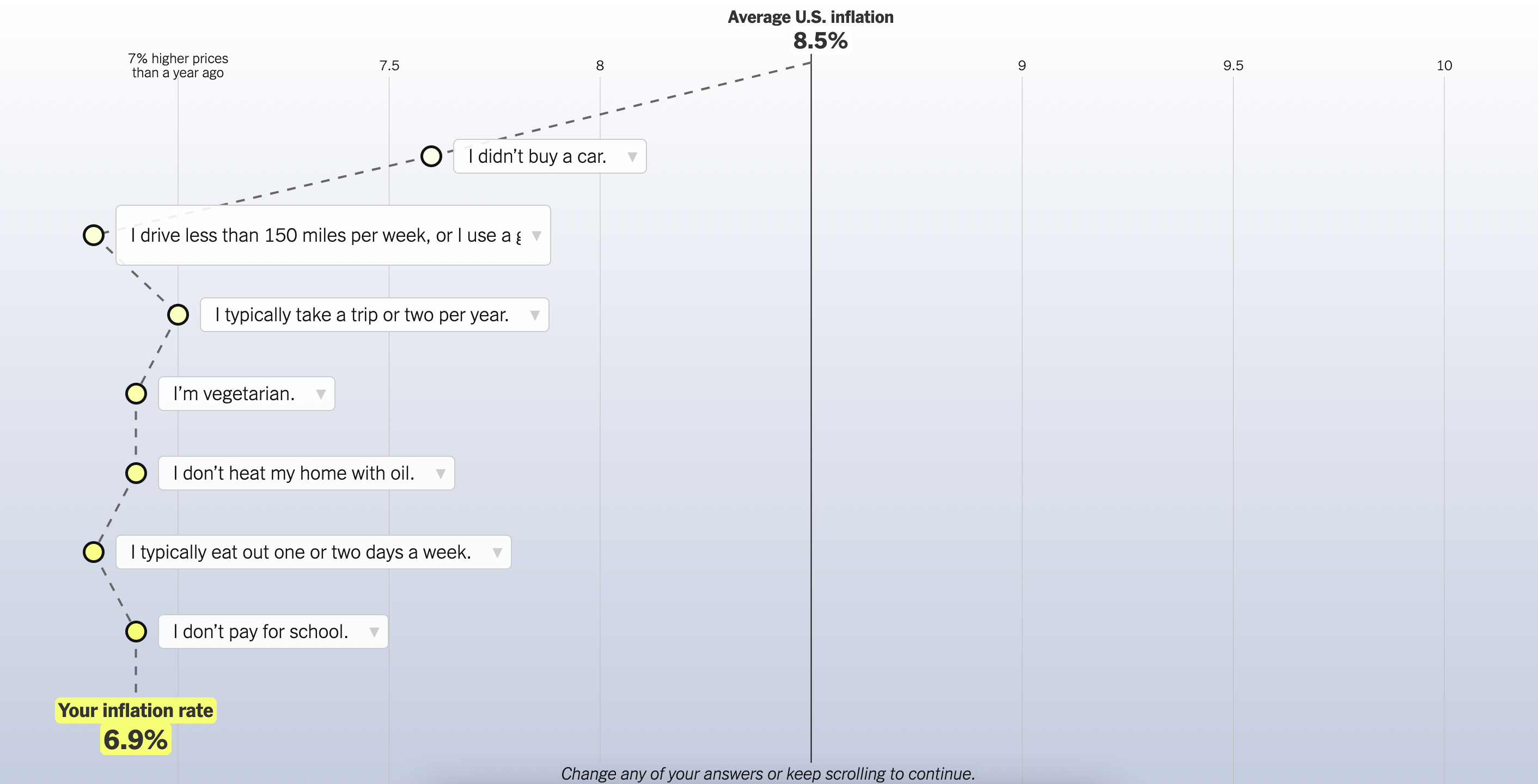
What's your rate of inflation?
When we see headlines about percentage change, we tend to assume that the shift affects all people equally. But this is hardly ever the case. The same is true for inflation. This interactive connected scatter plot adjusts the *experienced* rate of inflation and plots it based on how a user responds to a series of questions. In this case, it turns out that people who live more sustainable lifestyles (vegetarian, don't drive much, don't travel by plane, etc.) are affected less by inflation. One of those (unfortunately) rare moments when the right thing for the Earth is also the most cost-efficient short-term.
Learn
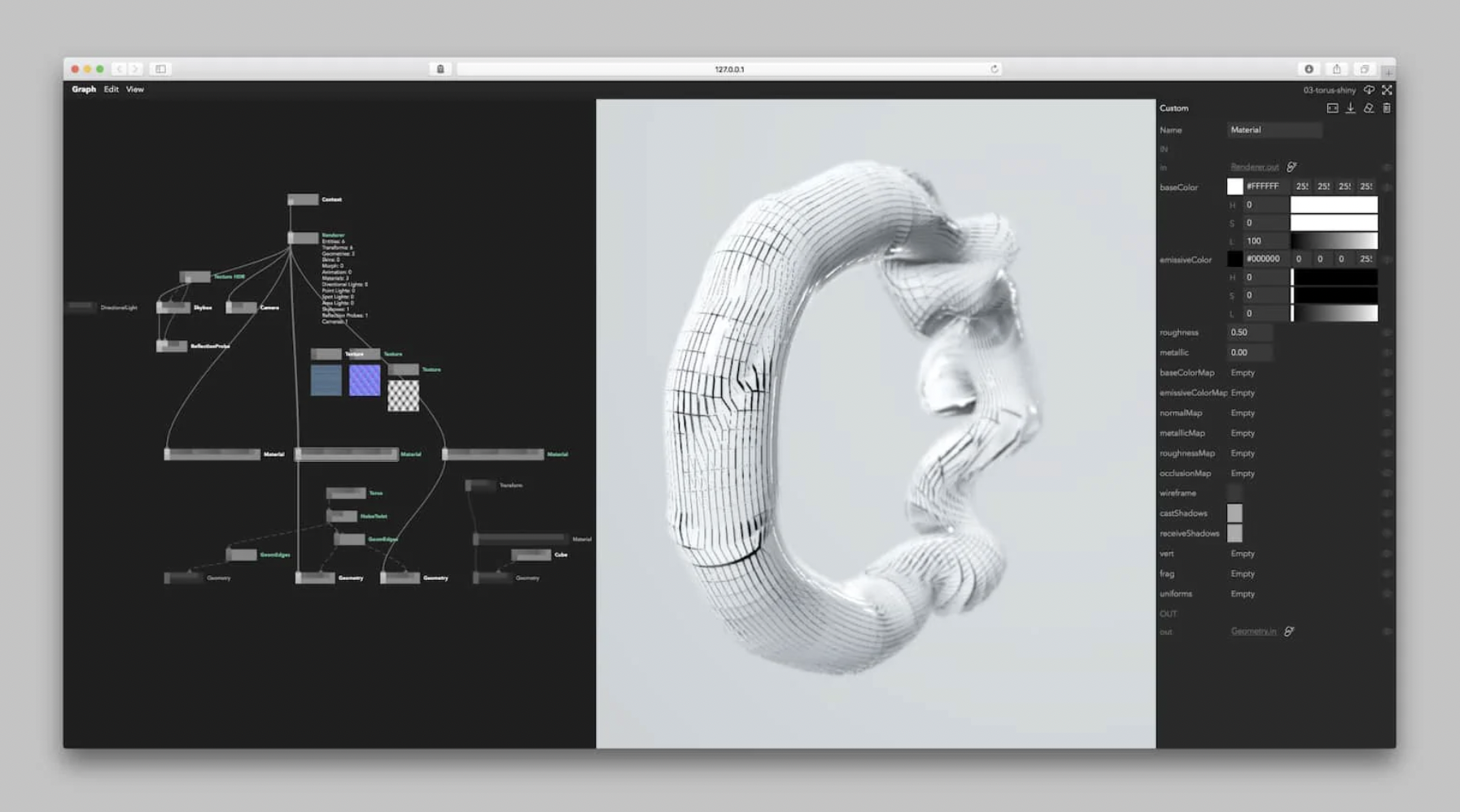
Nodes.io
Nodes.io has been on my list of tools to check out for a long time. The MRI of Earth piece I featured in last edition reminded me of why it caught my attention in the first place. This explainer article documents how the engineering team built this visual programming tool and how to get started. I found the Visual Tools Landscape board that the team created in their research process to be very interesting. Visual programming tools seem to be a quickly growing space and I’m eager to explore what Nodes has to offer.


