
Space sounds
Visualization as witnessing, sounds from space, bite-sized sonification

Starting off the New Year strong with another edition of Data Curious within 2 weeks of the last one! The last half of 2022 was especially sparse on the newsletter front. I’m trying out this ~2 week cadence for the first quarter of this year to see how it feels.
Today’s edition specifically highlights some sonification work that I discovered (perhaps re-discovered, as it seemed familiar). Also, the article linked in the “Read” section was particularly striking to me and felt very in-the-spirit of where this newsletter is going.
Thanks for reading Data Curious! Subscribe for free to receive new posts and support my work.
Hope you enjoy.
Read
Data visualization as an act of witnessing
This article from Mary Aviles, a qualitative researcher and strategist, describes the kind of work I have always been most drawn to—visualizations that go beyond information and into creating empathy. It’s something I have written about previously, using data visualization as a kind of grief practice.
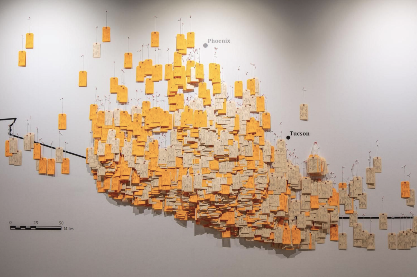
The Undocumented Migration Project is a perfect example of what Aviles calls “socializing the research”. Yellow color-coded toe tags represent migrants who died crossing the Arizona border. Each one has handwritten information, which was an intentional choice—volunteers had to spend time writing each name physically.
“Students did the handwriting. They shared that it was emotionally difficult for them. I wanted to put names to the dead. This is an act of witnessing. The data come from a Microsoft database. We’re asking volunteers to breathe life into the data by writing out the details. That was the closest way we could think of to get someone to feel the human cost. I’ve filled out hundreds of toe tags. It doesn’t get any easier.” - Jason De Leon
This detail struck me as especially poignant. Not only is the exhibit itself more impactful than seeing dots on a digital map, but the creation of the exhibit was impactful itself. A domino effect. I recommend reading the whole piece, as well as this article on the futility of Powerpoints by Michael Brennan (which also inspired the Aviles piece).
Listen
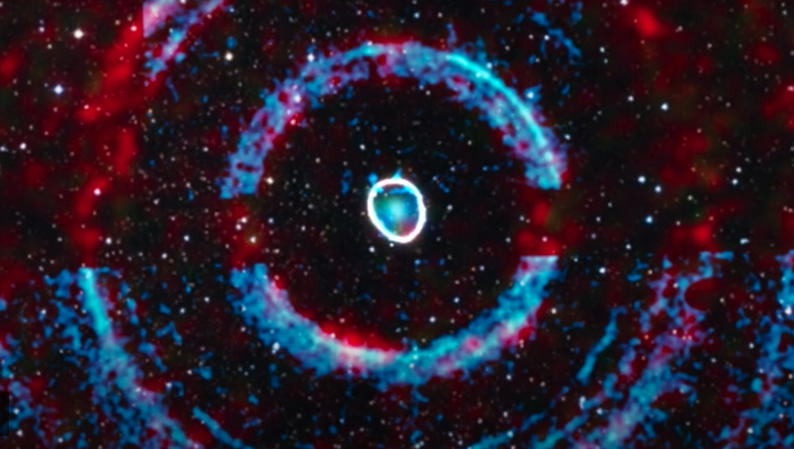
Sounds from Space
Last week I discovered this data sonification of a “black hole-star system” around 7800 light years from Earth called V404 Cygni. The firework is the sound of the black hole, followed by samples of waves crashing and random synth notes (representing stars). The full article is really interesting, but you can also listen to the short sonification on Youtube directly below. I find this “soundscape” approach to sonification fascinating—many sonifications rely on the time-based arranging data into sounds, but this approach seems to ignore that linear ordering in favor of a spatial one.
Learn
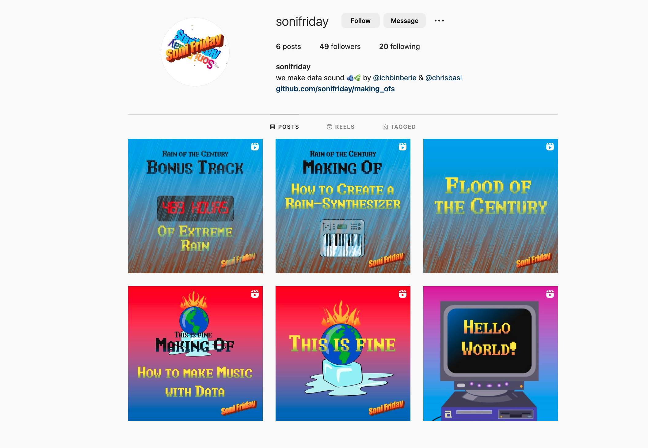
Sonifriday - bite-sized sonification tutorials
I discovered this Instagram account on the Decibels Discord (if you’re interested in data sonification, come join us!). In addition to creating original sonifications, Sonifriday also post some bite-sized “how-to” and “behind the scenes” reels. The “How to Make Music with Data” one looks especially nice as an introduction to using Sonic Pi as a sonification tool. Oh, and they post some of their code to Github!
Thanks for reading Data Curious! Subscribe for free to receive new posts and support my work.


