
The Birds are On the Move
Visualization as machine dialogue, a Bird Migration dashboard, and 1-line CSS layouts

Hey there. A few new folks have trickled in to the newsletter the past few weeks, so I wanted to start with a reminder/disclaimer: this is a semi-regular/irregular newsletter from me, Ben, about using data and visualization to understand the world around us. You can unsubscribe at any time (link in footer).
If regularity were a spectrum, I'd be firmly on the *irregular* side lately. Over the past few weeks, most of my spare time has been consumed by a part-time lecturing position I accepted back in March. I'm teaching Advanced Data Visualization Techniques at Northeastern University as part of the Information Design and Data Visualization MS. It's been a rewarding experience so far, although teaching a 3-hour night class certainly has its downsides too.
As someone new to the teaching/academia field, I feel like most weeks I'm building the car as I drive it. But it's been a gratifying experience to watch students learn in real-time and apply coding skills to build data visualizations in class. If you have any tips or resources on teaching, drop me a comment/reply! Aside from the teaching part, it's been fun to re-learn some programming principles I have long since forgotten.
With only two weeks left in the semester, I'm keeping my head down preparing lectures and grading final projects. After May 7, I hope to return to this newsletter with a bit more regularity.
Until then, here's a few links that caught my eye recently.
When Accuracy Isn’t Enough: Visualization and Game Design
This short article on using data visualization as a tool for interacting with machine learning sparked some interesting ideas about what we choose to visualize. Typically, the output of ML models will take the form of summary statistics on precision and recall, or maybe a validation curve int he form of a line chart. But the examples and references mentioned in this piece offer another approach, one influenced by game design: using visualization as a tool to encourage dialogue with the model. Literally, human-computer interaction.
"...information and game design ask how tools enable new ways of thinking and how models create not just solutions but dialogue...This echoes participatory design, approaches which center stakeholders to co-design with the engineer / designer".
I find this approach fascinating and think it's a natural evolution for how visualizations will be used for ML applications.
Explore
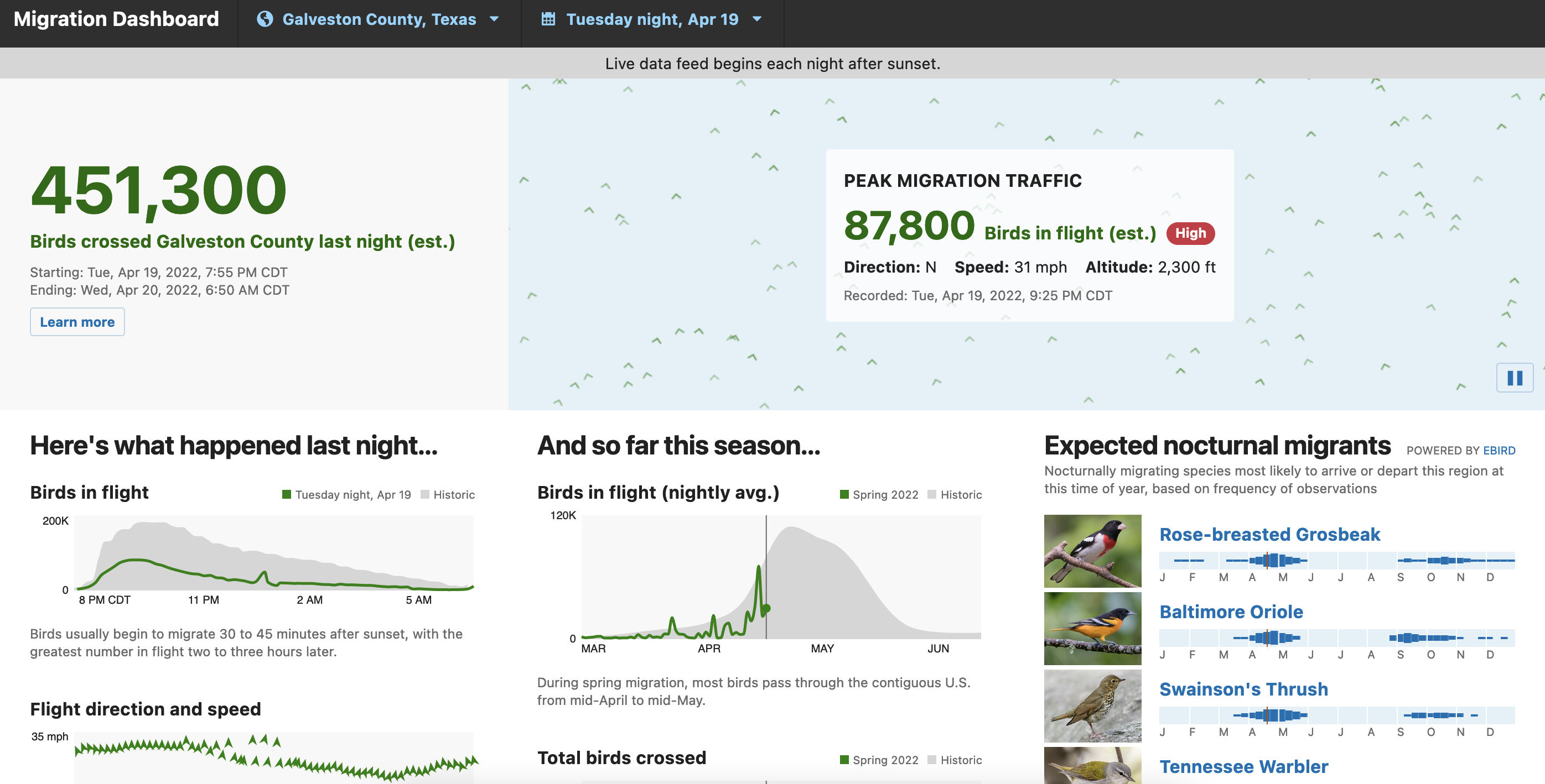
Team Birdcast Migration Dashboard
Over the past few months I have used my Twitter account less for viz stuff and more for bird stuff. And let me tell you, birding Twitter is a thing. I owe the following reference, which is both birds *and* data-related, to author and avid birder Jer Thorp. This Migration Dashboard packs in a dense amount of information while also feeling approachable.
I love the animated flocking birds behind "Peak Migration Traffic", and also the small area charts that compare current migration season to historical averages. Even if you aren't interested in birding (psst birds are magical creatures), birding by its very nature relies on counting, aggregating, and analyzing data. A perfect fit for visualization work.
Learn
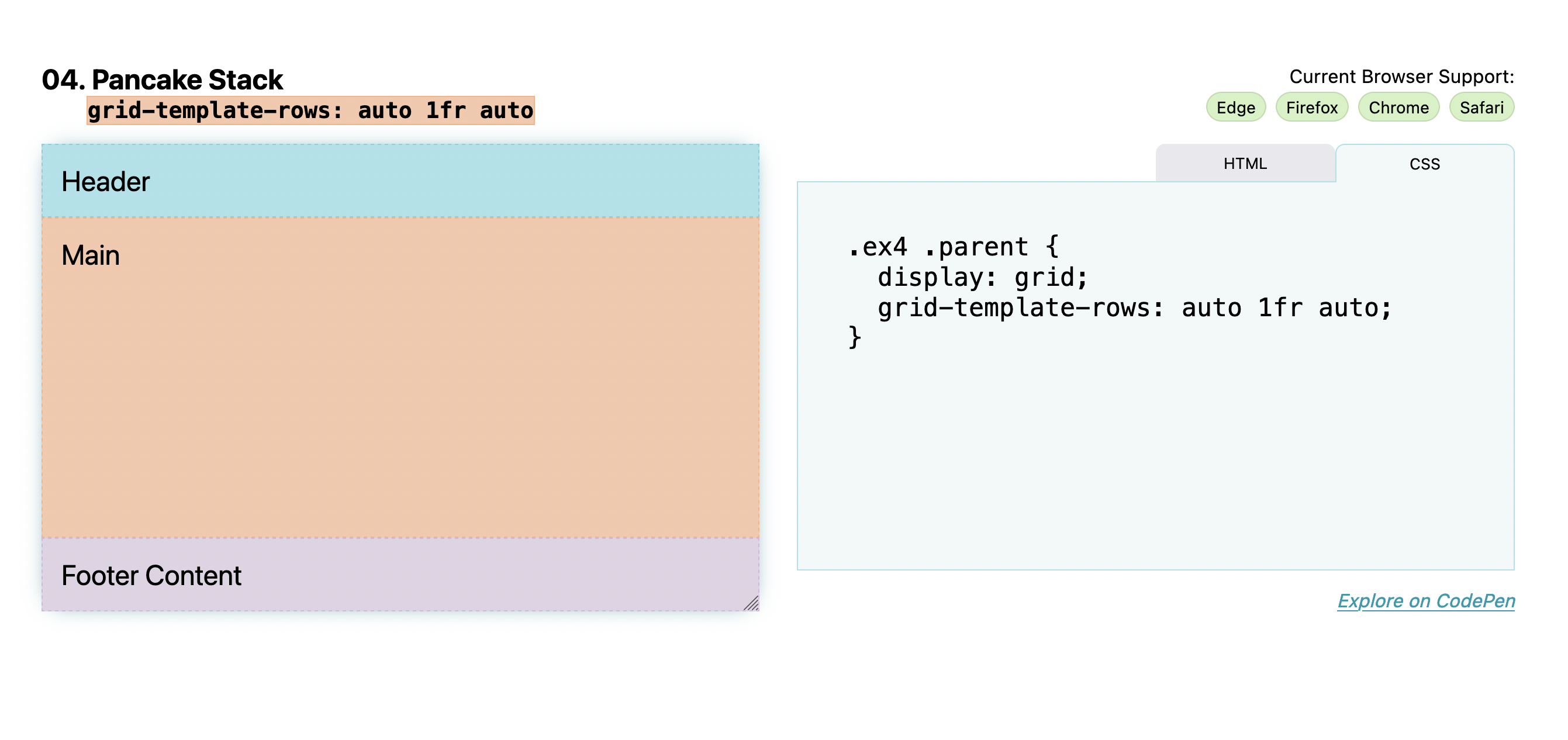
1-line CSS layouts
This week I took my students through a crash course in CSS layouts: what is flex? When should I use CSS Grid instead of flex? When do I need to use media queries for responsive design? While these questions do not explicitly have to do with data viz, almost all data viz on the web will be wrapped in some kind of CSS. So it's worth a revisit from time to time.
I owe much of the content for my lecture to the fabulous Glitch page linked above (plus Youtube video) from Google developer Una. Although technically some of these 1-line layouts are more like 2-3, this page is a treasure-trove of copy-pasteable CSS templates. It also helped me understand Grid much better. Hope it is equally useful for you!


