
The rise of anti-Asian American hate crimes
Hate crime reporting, anthropographics, and the UK lockdown experiment

The murder of 8 people in Atlanta, 6 of them women of Asian descent, was a hate crime born of misogyny, objectification, and racism. I’m writing about it because it needs to be said; but also, like so many things in our modern world, because how we view and document these tragic events depends on how we collect and view the data.
How we track hate
From 2019-2020, hate crimes against Asian Americans rose by 150%. This rate was especially high in larger cities like L.A. and NYC.
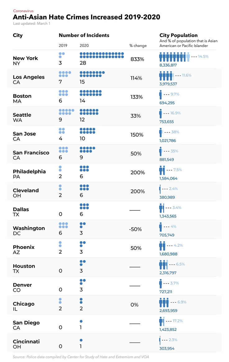
With a lack of data available nationally, the group Stop AAPI Hate was formed to start collecting hate crime reports in 2019. Last year they received 3,795 incidents of hate.
In 2021, we have continued to see this trend (CW in links ahead), even against the most vulnerable and elderly—a Vietnamese grandmother assaulted and robbed in San Jose, a 61-year old Filipino man slashed in the face with a box cutter on the subway, a 91-year old man thrown to the ground in Oakland. In Oakland’s Chinatown, there have been over 20 of these attacks and robberies this year.
Advocacy groups like Stop AAPI Hate should not have to exist, but they do because America’s local agencies consistently fail to document hate crimes accurately.
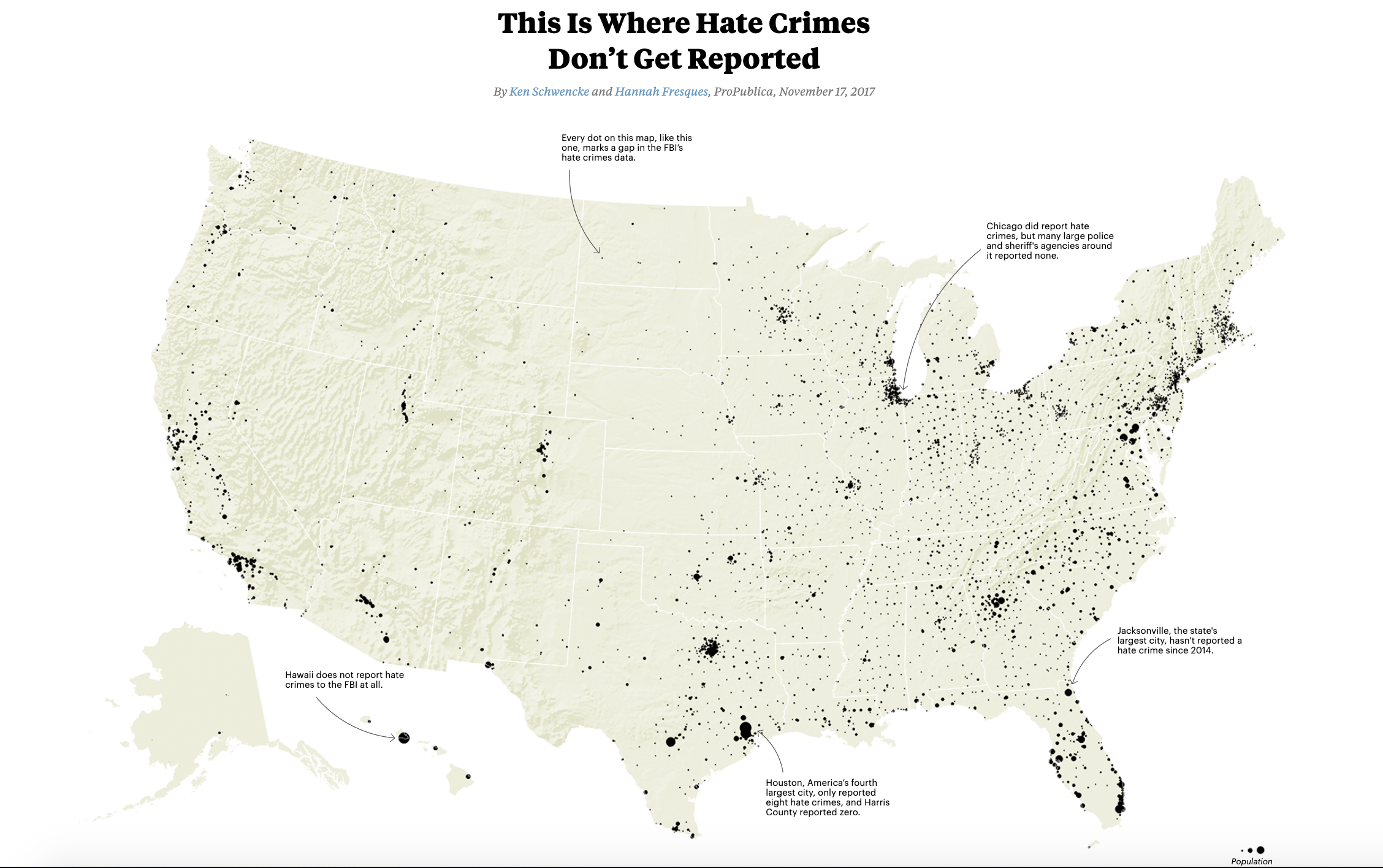
ProPublica has done some great work investigating why this is the case in the US. If you want to learn more, I highly recommend checking out the two stories linked above.
Studies on what influences a rise/fall in these types of hate crimes usually are hesitant to identify a single variable. But many of them have landed on a new term for a very modern phenomenon: it’s called the “emboldening effect”. Some also call it “the Trump effect”.
Here’s what it means in short: words matter. The words our leaders use matters. When groups of people are devalued and derided by public figures, it gives life and breath to the hateful and private thoughts of others. It happened as soon as Trump took office, when he called immigrants from Mexico “rapists” and “thugs”. He vilified them. He stoked hate.
Words matter. Accountability for how people use their words matters. Asian American and Pacific Islanders’ lives matter.
To ignore the role that race played in a shooting targeting only Asian American owned and operated businesses is to intentionally turn a blind eye. Taiwanese-American writer Jeff Yang put it best:
“Think of how fused and interwoven gender, race and sexuality are in society and culture, and the fundamental truth that killings like this are made possible because the perpetrators think of their victims as objects, less than human, as temptations or obstacles or vermin.” – Jeff Yang
That’s all for now. Here are some links for the week.
Read
Can Anthropographics Promote Prosociality?
A new visualization research study seeks to answer the question: does including person-related (anthropographics) illustration alongside the data make readers more compassionate? The researchers tested an information-rich “anthropographic” against a simple bar chart, and then asked participants how much money they would be willing to donate to a crowd-funded cause. The results? “We found that the anthropographic had, at best, a small effect on money allocation.”
More in this Twitter thread from one of the authors:
#DataVisualization is increasingly used to convey human tragedies. In our #chi2021 paper, we tested whether showing information about each victim makes people more compassionate than if they only see aggregated statistical charts.
— Luiz Morais 📊✊🏽 (@luizaugustomm) 1:01 PM ∙ Mar 18, 2021
Explore
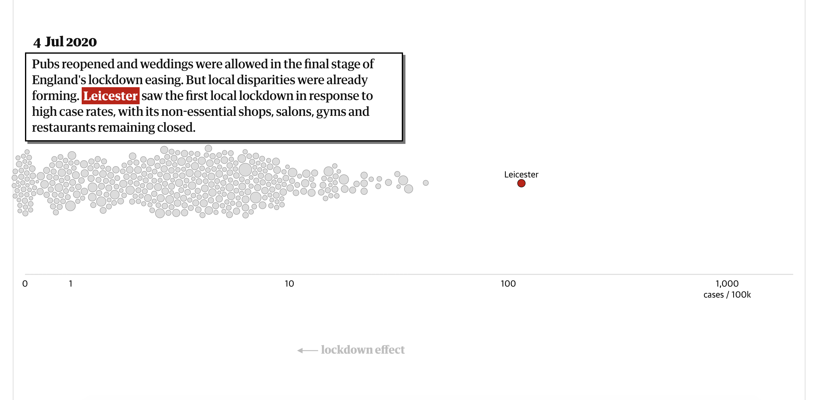
Revealed: the data that shows how Covid bounced back after UK's lockdowns
This piece makes effective use of scrollytelling (and a bouncy beeswarm chart) to show how cases fell, and then rose again, when lockdowns were implemented and then lifted. Many data visualization pieces have looked at the impact of lockdowns on Covid case rates, but this one felt particularly impactful: “…while all three national lockdowns were successful in reducing infection rates, each was lifted when cases in at least some areas were too high, leading to rebounds.”
Found while scrolling
Improve your data-driven storytelling with this treasure trove of resources curated by designer and developer Moritz Stefaner:
Weekend readings — If you are interested in data-driven storytelling in #dataviz, make sure to check out this list of patterns we collected napa-cards.net and read the corresponding book chapter linked below (free right now!)
— Moritz Stefaner (@moritz_stefaner) 7:17 AM ∙ Sep 7, 2018
Cool JS trick that I often forget about!
JavaScript tip: you can use negative indices on Arrays, Strings, and TypedArrays with "at" ✨
— Minko Gechev (@mgechev) 5:30 AM ∙ Mar 9, 2021
In case you miss this Python feature in JavaScript..., well, it's already at Stage 3 🚀
Example 👉🏻 buff.ly/38jSb2i
I stumbled across this website hosted where the most solar energy is being harvested. Very solar punk. Very cool.
Sharing new work: Solar Protocol is a website hosted across network of solar-powered servers, stewarded by volunteers across the world. The website is served from whichever server is enjoying the most sunshine. Collab w/ @benedetoula & @solar4artists solarprotocol.net
— brain (@tegabrain) 7:13 PM ∙ Mar 16, 2021
Learn
Make charts using only CSS
A lighweight CSS framework for converting HTML tables into charts! I have not heard of Chart.css before, but it looks pretty cool. Nice way to add some color to HTML tables at a very low computational cost. (h/t to Maarten for the tweet below).
Interesting: Chart.css, a css framework for charts chartscss.org Turn html tables into charts by applying some classes. Makes total sense for simple, lightweight dataviz
— Maarten Lambrechts (@maartenzam) 11:47 AM ∙ Mar 19, 2021


