
Thinking critically about datasets
A critical dataset reading list, visualization of design semantics, and getting started making sound in the browser

How much should we trust data? What can machines really “learn”? These may feel like technical and potentially jargon-y questions, but regardless of your technical knowledge, these questions affect you one way or another.
Machine learning at some level is just a series of inputs and outputs. Input training data, output predictive results (for example). What we feed into these algorithms will color everything that comes after. Which is why thinking critically about how the algorithm was trained is so important. Skipping this step can lead to harmful results, like when a Google algorithm labeled a black person with a thermometer as holding a “gun” and a light-skinned person holding the exact same thermometer as an “electronic device”.
Thanks for reading Data Curious! Subscribe for free to receive new posts and support my work.
This first link in this edition is a treasure trove of research asking critical questions about how we should question our ML training data and sources. I already have a few bookmarked, so I hope it also proves interesting for someone else. As someone who’s role is often to visualize output of some machine calculation, I can naiively think of myself as removed from this process. But visualizing this type of data requires a similar level of critical thinking: where are the gaps in the data? What is appropriate to highlight, and where should I include caveats?
If you’ve got any additional resources around this topic, drop it in the comments or reply to this email!
Till next edition,
b.
Read

Critical Dataset Studies Reading List
The team behind Knowing Machines put together this reading list of resources to help people think about Machine Learning critically, to understand how ML datasets are formed and trained, and to think about how this shaping process affects the outcome. Data is never truly unbiased. This list is a treasure trove of research showing how and why.
I had never heard of Knowing Machines before, but I’ll definitely be keeping tabs on them in the future:
“Knowing Machines is a research project tracing the histories, practices, and politics of how machine learning systems are trained to interpret the world.”
Explore
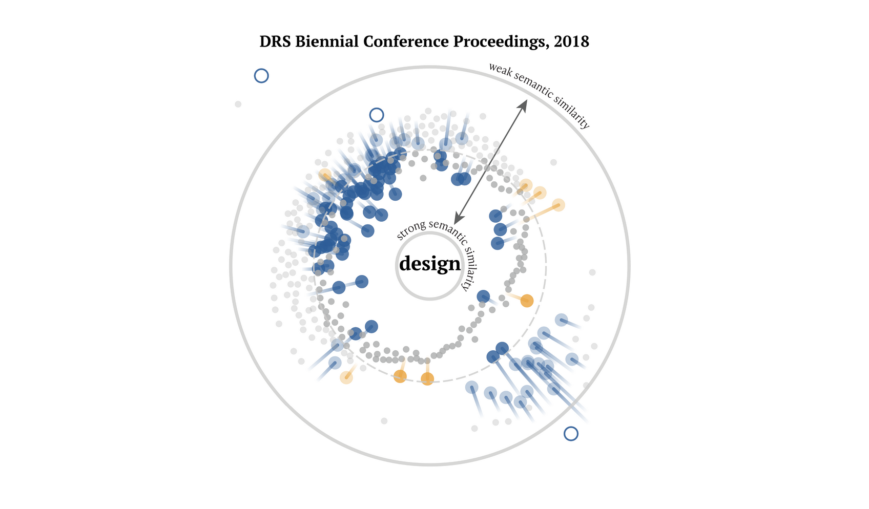
Design vocabularies: what we talk about when we talk about design
“When we say design, what do we mean?” This visualization and scrollytelling story explore how the terms around “design” have shifted over time. Created by Steven Geofrey and the Design Observatory, a research project at the Center for Design at Northeastern University, the piece explores how words commonly associated with design have become more or less common from 2004 to 2018. Words like “data” and “technology” have become much more common (no surprise) while words like “international” and “common” have become used less frequently.
I really like the radial arrow plots here as a way to visualize the word vector analysis data. Check out the data explorer section at the end for some cool interactive comparisons for any given word.
Learn
======o     o======
   ___________
  |___________|
   |\  /\  /\|
   |_\/__\/__|
  |___________| AH
Synthesizing and analyzing sound with P5.js
I’ve been gradually experimenting with some sound analysis, production, and visualization lately, and have found this tutorial by Allison Parrish absolutely invaluable. If you know a bit of Javascript and want an easy introduction to producing and manipulating sound in the browser, start here.
Thanks for reading Data Curious! Subscribe for free to receive new posts and support my work.


