
To All the Books I Read in 2020
A long overdue reflection on my reading history in 2020, 10 years of d3.js, and visualizing vaccine roadblocks

Surprise! It’s an end-of-week edition of the newsletter. I was feeling spontaneous (and also, way behind on some other work).
Looking at my notes, I realized that I published a total of one (just one!) edition in February. Welp, here we are. I’ve got extra stuff this week!
The first Outlier conference, hosted by the Data Visualization Society, took place at the beginning of last month and supplied tons of inspiration/food for thought, some of which made it into this newsletter. First, a few notes.
What I’ve been up to
Last month was a big push for some side projects I’ve been nursing for a while now. They’ve been under the radar so far, but it feels like the right time to pull back the curtain (very slowly, biting my nails, please don’t let anything break, etc.)
In 2020, I did my best to track some personal data about myself for an end-of-year visual review (I also did this in 2019… you can view those visualizations here or read about the process here).
Needless to say, last year the usual metrics (steps, workouts, travel destinations) ended up being…not very interesting. You know, pandemic etc.
But I did manage to do a lot of reading. I used Goodreads to track my books and gave myself the rule to leave a review of at least one sentence every time I finished a book. This forced me to reflect on if I actually liked the book instead of giving it a random number of stars, and it also helped me to remember the book later on.
After weeks of tinkering with small improvements, I’m ready to call it done for now and move on to some more important work. Side projects should be fun, after all.
To All the Books I Read Before (in 2020)
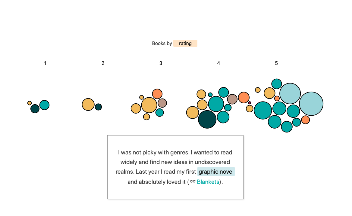
I made a bubble scrolly story! After downloading my data from Goodreads and adding a few data annotations, I visualized each book as a bubble (sized by number of pages). The app was built using Svelte, and as my first Svelte app let me just say, it was a breeze. Svelte even has a scroll-based component you can use off-the-shelf for triggering the viz transitions.
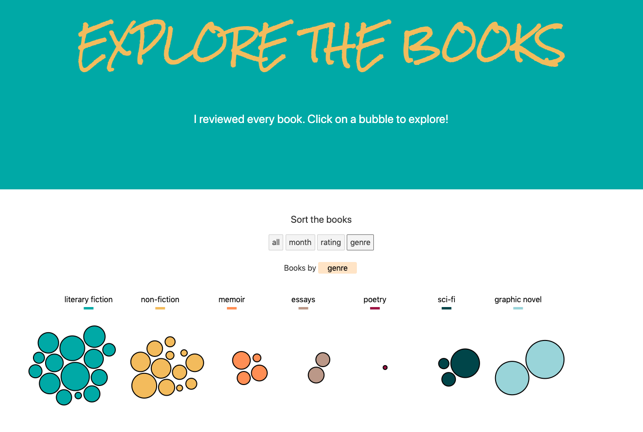
I wanted to be able to sort the books at the end of the “story” section by different categories. This section is all about exploring each book. You can click on a book to read my review in a separate “info card” component. Each card contains more information about the book, such as genre, cover art, topics/themes, and a link to add it to your own Goodreads list!
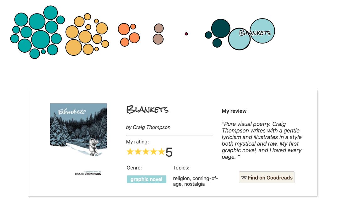
While I have conflicting feelings about its parent company (Amazon), my favorite part about using Goodreads is the ability to quickly find and add books to my “to read” list. If a friend leaves a 5-star rating for a book, I can add it in one click. I wanted to replicate this feature for my story. You don’t need a Goodreads account to “Find on Goodreads”, but if you do have one, adding the book to your wishlist is two-taps away.
The code could use some TLC and the mobile experience is, well, not great yet (bigger screen encouraged for viewing). But I decided I’d rather have this little baby app out in the world in its currently imperfect form than burn more hours on a story just for me. Some more important projects are in the works…
So if you’re into it, here ya go! Let me know what you think in the comments. Maybe a “the making of” blog post coming in the future? TBD.
Now the links.
Read
10 years of open-source visualization
If you’re on data viz Twitter, you likely saw that last month marked the 10 year anniversary of the beloved library d3.js. Its creator Mike Bostock wrote a blog post on 10 lessons learned along the way. There have been very few people who have contributed as much as Mike Bostock to visualization on the web, so his word is pretty much the gold standard.
Behind the scenes of making a COVID-19 vaccination dashboard
I wanted to include a second “to read” piece here because a) it’s fascinating and b) it’s quick since it’s a tweet thread. During the Outlier conference, I stumbled upon the below thread from data viz designer and developer Moritz Stefaner which explains how he built a vaccination tracking dashboard. He includes some very insightful rationale as to key design decisions throughout the process (using text instead of a chart for example!) and also some takeaways on the tech side of things.
✨New work!✨
— Moritz Stefaner (@moritz_stefaner) 2:01 PM ∙ Jan 22, 2021
It's the official
🇩🇪 German
💉 COVID-19 Vaccination
📊 Dashboard
impfdashboard.de
for @BMG @rki_de
with @StudioNAND @CosmonautsKings
🧵 A few thoughts on design/tech:
Explore
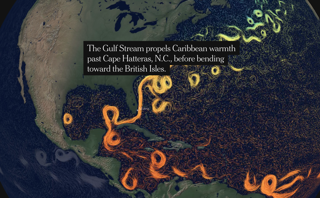
In the Atlantic Ocean, Subtle Hints at Dramatic Dangers
The maps in this piece are quite honestly stunning. I can’t imagine the engineering work that went into creating the animated water currents across this spherical globe. Truly blending art and science here.
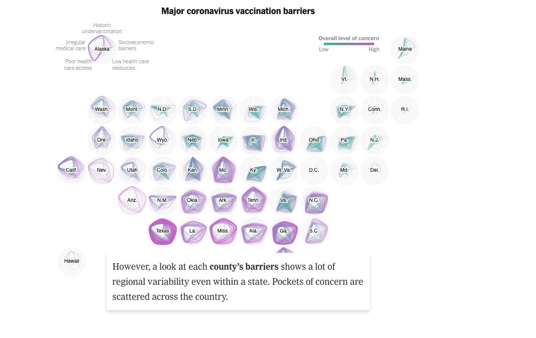
Vaccine Roadblocks Where You Live
The scattered and slow vaccine rollout continues to dominate the news. This data viz story put the uneven distribution into more context using a couple of really smart visualization techniques. The obvious first choice is personalization (“what’s going on in my state?”).
But I particularly loved these small multiple radar charts of each state. It manages to pack in a dense amount of information by comparing five different factors that affect vaccine distribution. But then, it goes even further! Because this is America, we know that there can be vast differences within the same state depending on what county you live in. By adding a new line for each county, we can also see the variability of each state, or how different the rollout might be per county. Brilliant.
Why you need high vaccination rates to stop a pandemic
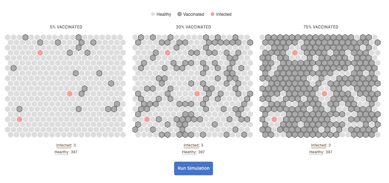
Another herd immunity simulation, but this time with hex grids! I really like the feel of these grids. The story contains multiple scenarios (variants, low vaccination rate, low natural immunity, etc) to help put the simulation into context.
Found while scrolling
Did anyone else watch the Mars rover landing? Did anyone else notice the binary code embedded into the parachute that spells out NASA’s exploration motto “DARE MIGHTY THINGS”? I did neither of these things, but I read about it later on Twitter and damn, humans can be pretty amazing sometimes.
For those who missed it: The binary message encoded in the #PerseveranceRover parachute. #dataviz
— Randy Olson (@randal_olson) 5:20 PM ∙ Feb 25, 2021
Source: reddit.com/r/dataisbeauti…
Data visualization tool company Flourish has introduced a new feature to their tool that looks like an interesting alternative to “chart in tooltip”. I find chart-in-tooltips to be a nightmare when it comes to interactivity and accessibility, so would be interested to try out this semi-transparent modal approach instead.
💬✨🖼️ Introducing popup panels 🖼️✨💬
— Flourish (@f_l_o_u_r_i_s_h) 10:44 AM ∙ Mar 4, 2021
In addition to popups, you can now add panels to your Radar and Projection map visualizations, giving you more flexibility to tell rich data stories.
👉 Learn more and check out the examples in our blog: flourish.studio/2021/03/04/pop…
Cartographers have created yet another alternative map projection that claims to be “the least distorted ever made”. I just like that the hemispheres look like two sides of a record now. Either way, pretty cool! (actually, I actually care a lot about map projections, which you can read about in this edition).
No flat map of our round world can be perfect. Distortions in distance, scale and size arise when we flay out the whole planet on a single page or screen.
— The New York Times (@nytimes) 8:40 PM ∙ Feb 24, 2021
This new map, double-sided like a vinyl record, aims to minimize those distortions.
Confused by CSS transition types? Here’s a gif! (and blog post that has interactive parameters).
🎉 Just published a new blog post: “An Interactive Guide to CSS Transitions” 🎉
— Josh W. Comeau (@JoshWComeau) 3:30 PM ∙ Feb 9, 2021
It's a deep dive into `transition`, the CSS motion workhorse. We'll discover different timing functions, learn about UX and performance best-practices, and more! ⚡️
→ joshwcomeau.com/animation/css-…
Learn
Generative blob characters using SVG
No practical application to data viz here, but I just found this tutorial incredibly fun. Maybe someone could use generative blobs instead of pictograms? Or for little annotations?
tidy.js for wrangling data into multi-line and stacked charts
Wrangling data for multi-line charts and stacked bar charts in d3 has always been a hassle. Peter Beshai has an Observable notebook that demos his tidy.js package which seems v useful.


