Viz Vibes

Happy New Year! Starting the year off by recapping a few projects wrapped up last year.
The first is something I'm calling "Asteroid Tones", a live data sonification of asteroids passing Earth today. It pulls data from NASA's Near Earth Object API to create a time-dependent soundscape of space around Earth. (Note: the sun and earth are not to scale, just for illustrative purposes).
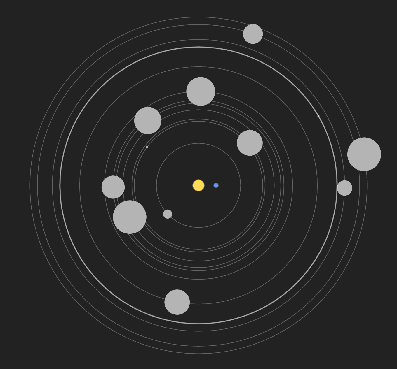
You can check out Asteroid Tones here. I designed it to be a sort of generative, data-informed screensaver which changes from day to day. Some days will be sparse, others busy, but hopefully always musically pleasing.
The next project is an interactive show for Highlight, the NYE Festival in my home city of Burlington, VT. Along with my friend Nate Hicks, we have designed an immersive show with a team of aerialist dancers. To do this, I had to dive into the world of hardware electronics via Arduino.
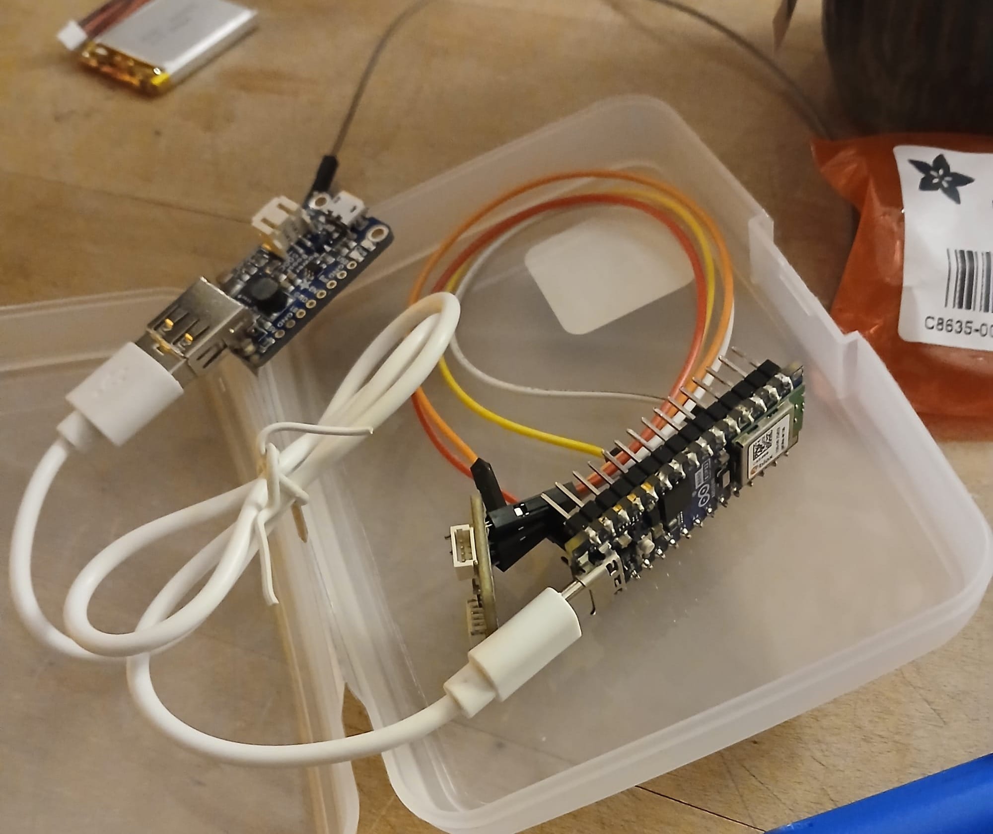
For each piece, an aerialist wears this sensor on their leg. The Arduino ESP32 then sends real-time movement data over Wifi to a laptop running Touchdesigner, which creates the animated visuals. Each scene has a different mapping, so the dancers movement will control a different visual parameter.
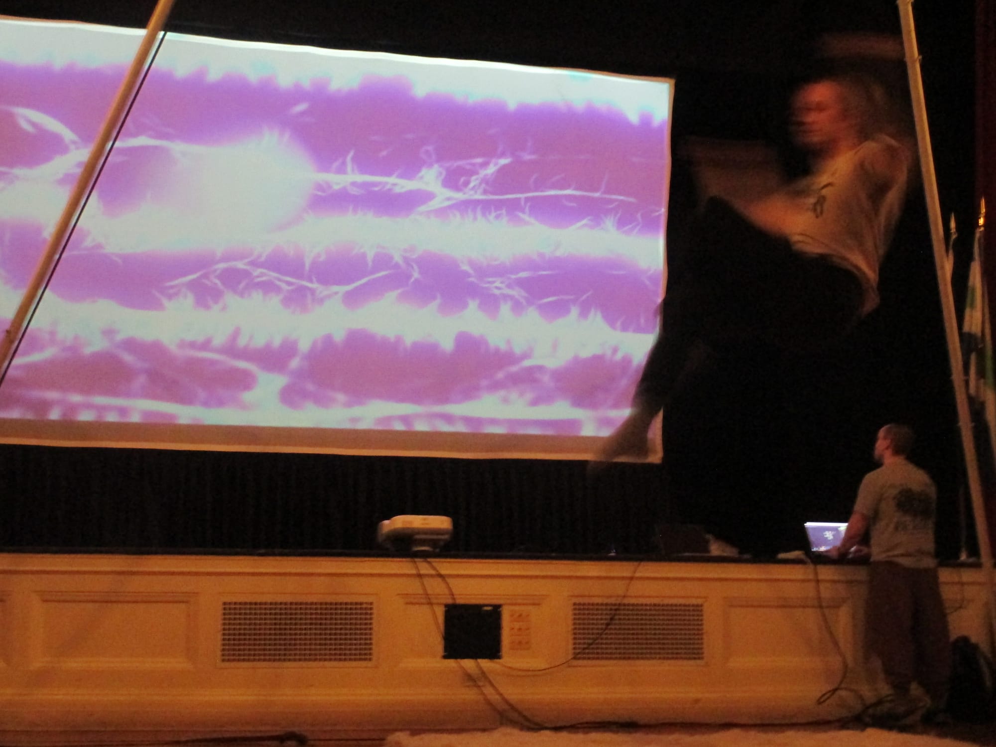
Sometime in the coming weeks I'll share footage from the show, which was a big success!
Finally, I wanted to share a little behind the scenes / work in progress shot of a project at work that will be launching in early 2026. I've been building a new site that let's you:
- search for any word across all of Wikipedia
- see how this word has risen or declined in "popularity" (measured via page-weighted frequency of term)
- explore the most viewed Wikipedia articles containing this term for a given time window
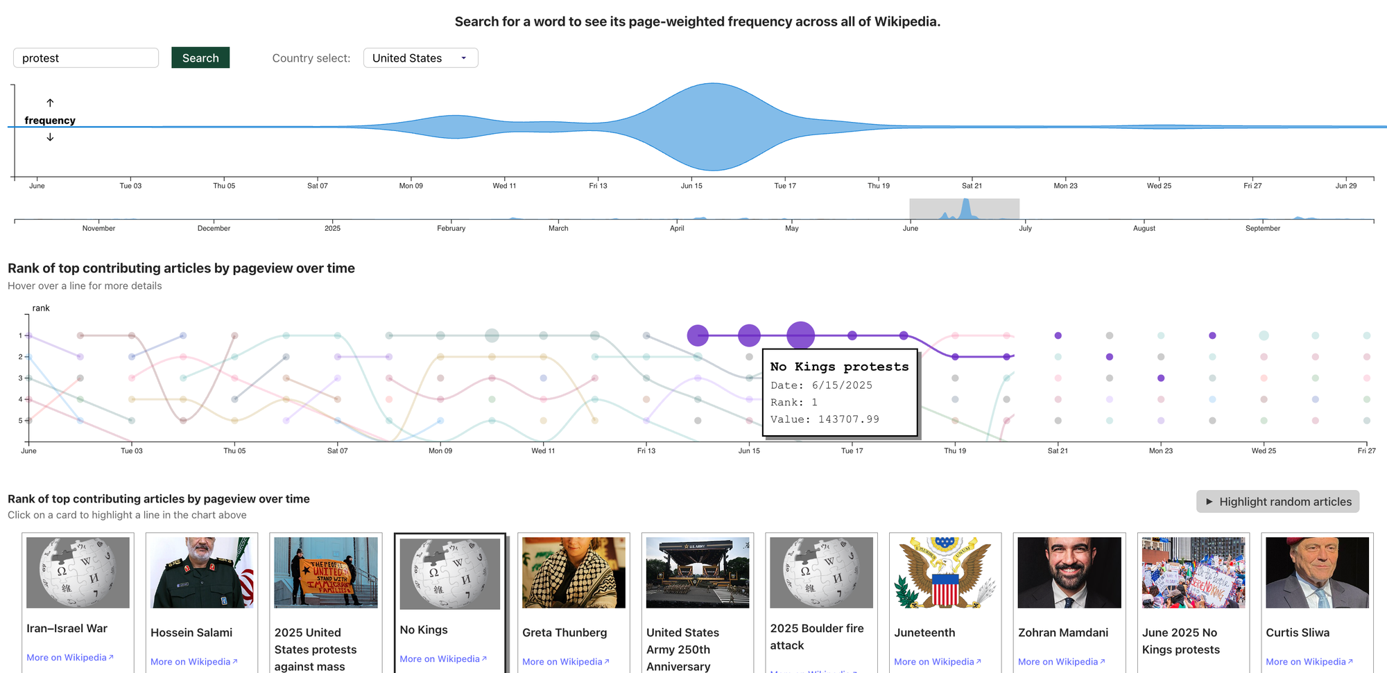
It's been a massive undertaking. To get this data, my department at UVM is ingesting all of Wikipedia text every day for parsing. I forget how much data exactly this amounts to, but suffice to say, it is big. Will have more to share on this in the coming weeks!
That's all for updates, now here are a few things that caught my attention recently!
Read
Visualization Vibes
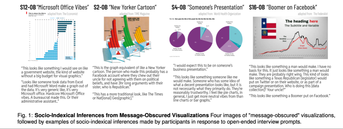
I work at a university, so new papers on visualization tend to be sent to me pretty quickly. Researchers at MIT have shown that the old adage "the medium is the message" also applies to data visualization.
"The researchers found that even the clearest visualizations often communicate more than the data they explicitly depict, and can elicit strong judgments from viewers about the social contexts, identities, and characteristics of those who made the chart." - MIT News write-up
Maybe this takeaway feels obvious on the face of it. But often I find people assign an illusion of objectivity or truthfulness to charts because they are "data-driven". It turns out, how you decide to make the chart may be as important—or maybe more important—than the data itself.
Some of the quotes from the article really stuck with me, particularly the ones that distrust a graph with more design elements in it:
"If it’s so pretty that it’s clearly been made by a graphic designer and approved by a marketing team, it’s trying to sell you something. But this? Microsoft Office vibes are very neutral and a bit more objective."
So maybe standard, out of the box, boring charts are better?
Here's another one, this time in response to a chart by an award-winning designer that uses hand-drawn elements in the graphic saying it was probably made by "some female Instagram influencer who is just trying to look for attention."
And another quote, about the same graphic: "something like this, like Instagram-y, I would immediately be skeptical".
I highly recommend giving the full paper a read, or at least skimming the MIT summary. Data is not immune to people's assumptions about what "side" you're on or what kind of "vibe" you give off. The way we design gives off a signal about who we are.
Explore
DATASONICA
Data artist Tiziana Alocci turned a building into an orchestra for her recent work DATASONICA.
"The work challenges how we perceive built environments, treating buildings as sentient bodies capable of generating their own music."
Sensors from Building 59 in San Francisco are translated into frequencies, harmonics, and spectrums of light in this evolving data sonification and visual art piece.
The full case study write-up on her website is fascinating, and touches on a theme that keeps coming back to me this year: what if our built environment could tell us something more about our natural environment? So often these worlds are kept at odds, one designed to block out the other. This project is a fabulous example of integrating the two, bringing the outside world inside.
Learn
Beautiful Public Data
A fantastic resource for exploring public datasets, with some great inspiration for visualization. I can't believe I had not stumbled upon this before, but I'm delighted that I found it now. Read and/or subscribe to the newsletter here.