Sounds before summer

Hey there,
It's been a while, but life has been busy. I wanted to send a new issue before summer fully takes off with a few updates on what I've been up to, plus the usual links and online resources that I've been saving recently. This issue might be a bit longer than normal as I have lots of fun things to share, but as usual, feel free to skip around or unsubscribe in the footer if this doesn't feel like your thing anymore. Nobody needs more unread emails in their life.
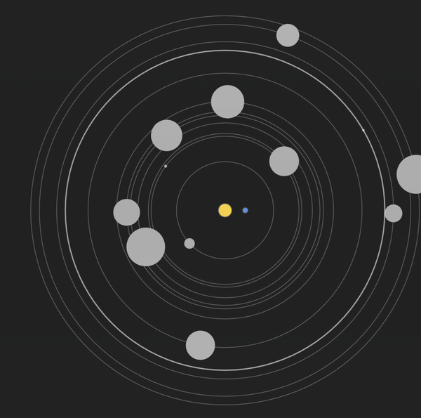
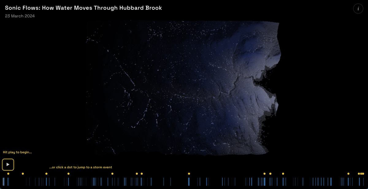
At the start of this year, a group of folks from Decibels decided to form a team for the Hubbard Brook Forest Data Jam, a call for multisensory art projects that transform environmental data into compelling stories and experiences. We split up the creative tasks among the five of us and I was responsible for the sound design and data sonification implementation. The team was: me (data sonification, sound design), Duncan Geere (design, web dev), Max Graze (sonification concept) Micah Lewis (data analysis) and Simon Rydén (generative map visuals).
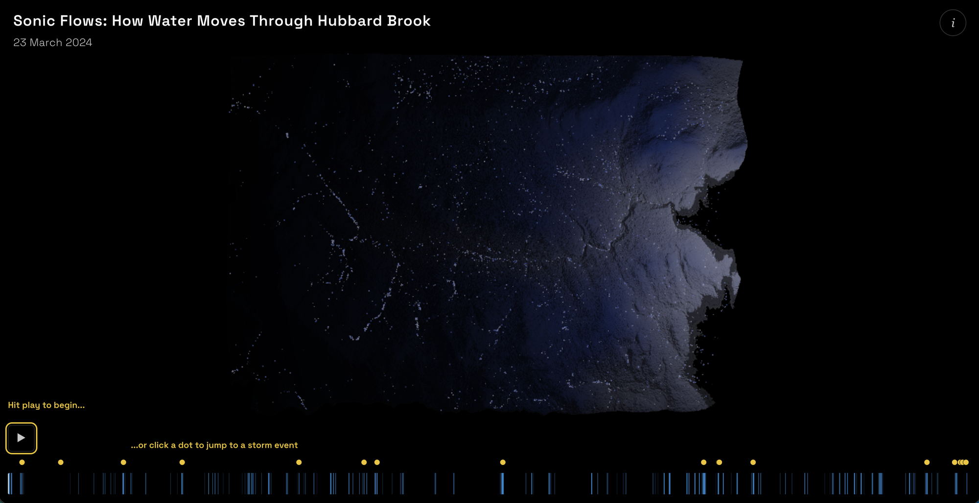
Using one year of data, the piece captures how precipitation can relate to streamflow and soil moisture of the course of one year. The experience was created with two modes in mind: it can be listened to passively in its entirety, as a gentle ambient sonic journey with events throughout. Or it can be experienced "on demand" by clicking on the yellow dots in the interface to jump to large stream flow events (i.e. where streamflow speed increases significantly). I also had the pleasure of visiting Hubbard Brook in person and taking field recordings of the water to incorporate into the final piece. Our entry won 3rd place and special marks for "best technical implementation of a multisensory experience".
You can experience the piece for yourself here. You can also read more about how it was made here. And finally, you can browse all entries in the Data Jam Showcase website.
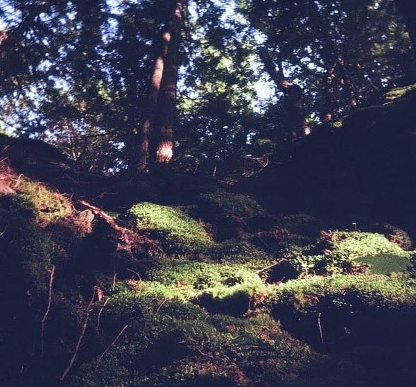
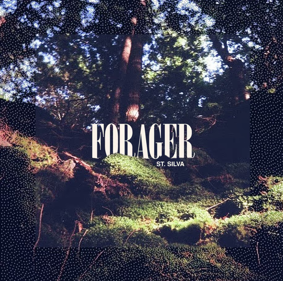
This next project isn't a "data" thing, but increasingly my work is spreading into adjacent fields from where I started (data viz, mainly) so I still wanted to share: last week I announced my debut full-length album as St. Silva, titled Forager. "St. Silva" is a musical moniker I adopted some years ago as a framework to explore some experimental and ambient soundscapes.
Forager will be released digitally and on limited edition cassette on July 17th through AKP Recordings. I call it my "debut album" because even though I have released music in the past, this is the first with substantial label support. You can listen to the first single and pre-order the album here. I have been a huge fan of the AKP label for a few years now, so am very excited to be part of their roster.
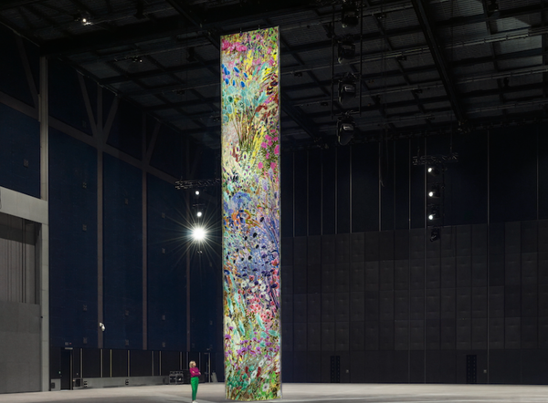
Looking at last issue, I remembered that I gave a teaser of an interactive project titled LUNARCY that I had just finished up. That happened a while ago now, but I finally got around to writing a case study and uploading some photos and videos from the show, which you can view here if interested.
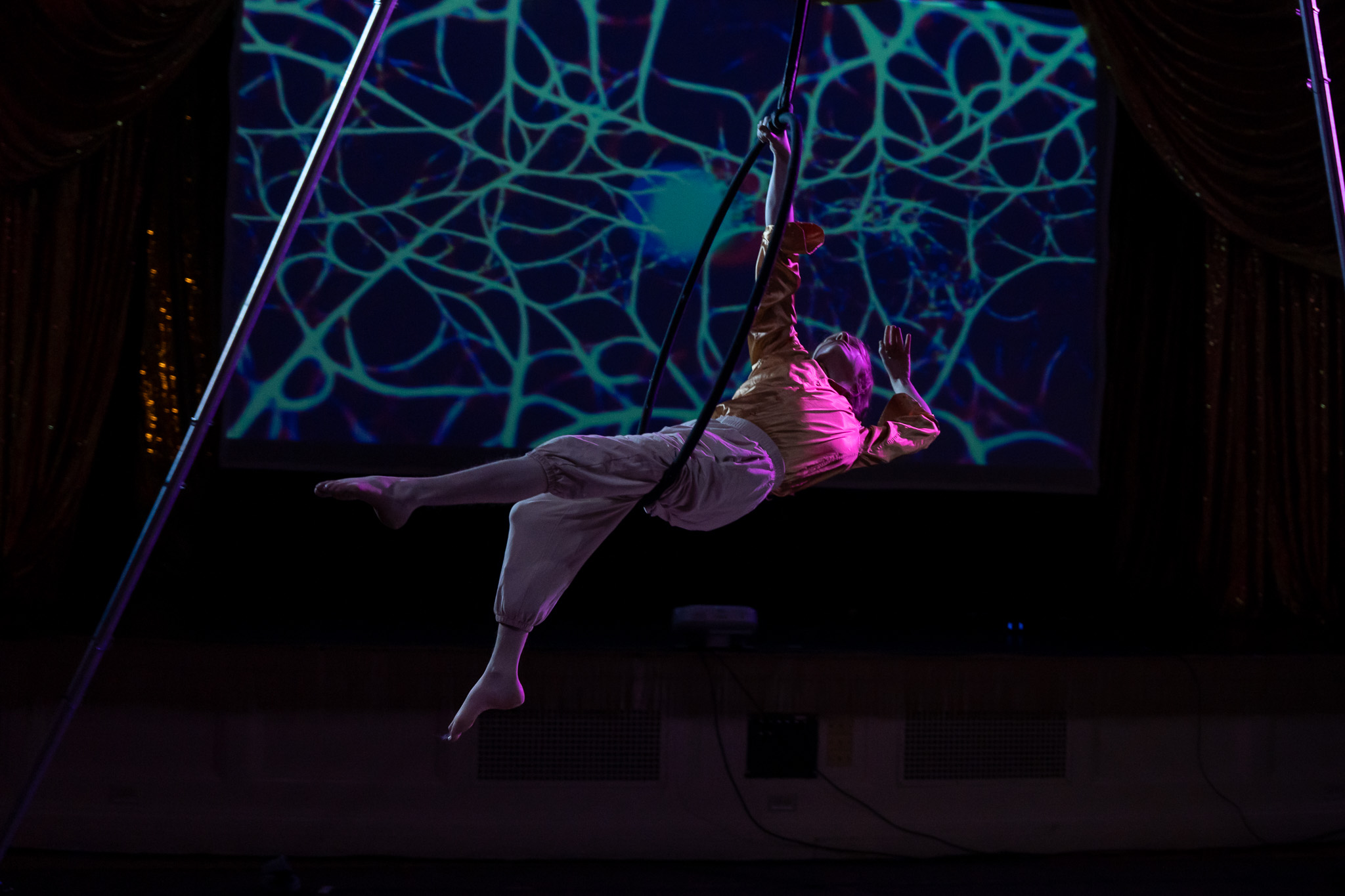
An interactive project of this scale, with sensors sending data in real time to a laptop running Touchdesigner, and an original soundtrack to accompany it, was a huge undertaking. I'm grateful for the experience and to the Burlington Highlight festival for helping to fund it.
The photos and videos of the show are really great, and as mentioned I put together a full write-up of how we did the show, so instead of rambling on I will just drop this link for those interested in seeing more.
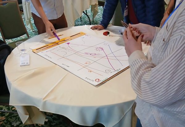
Finally, I also recall sharing a bit about the Wikipedia project I have been building. This summer UVM is hosting the 12th International Conference on Computational Social Science (IC2S2) and we will be unveiling the project in full. So I'll have more to share in July for the big public release.
Ok, enough about me. Here are a few things I found fascinating/useful online and maybe you fill find them fascinating/useful too.
Read
A behind-the-scenes look at the invisible design choices that shape credibility in data journalism
This piece feels like a logical follow up to the research paper I described in my previous issue. Essentially, researchers found that people make judgements about the content of a design (including data designs) before even understanding what they are or how truthful they are.
This story from Namira Haris looks at how this plays out in data journalism. This quote really struck me when interviewing Jan Diehm about a recent story of hers:
“There’s something about a human aesthetic, or a slightly messy, scrappy vibe, that feels handmade and authentic,” she said. “It signals there’s a person behind the work.”
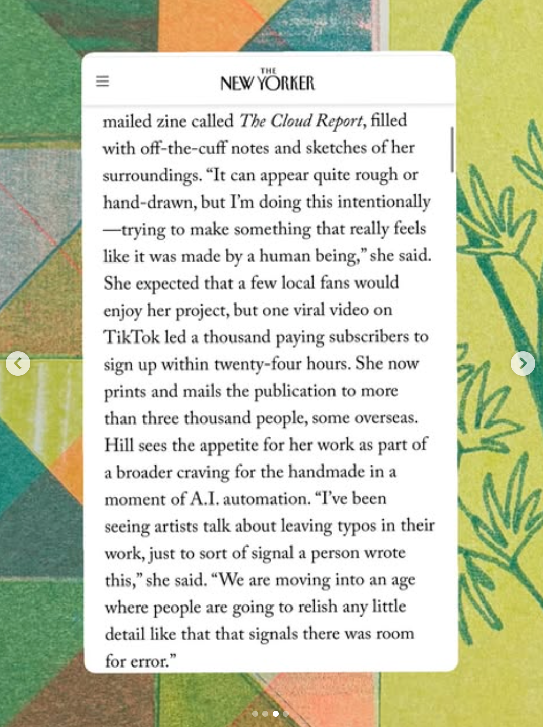
One day while scrolling Instagram, I came across this interview with Christine Tyler Hill (Burlington local and author of the now viral Cloud Report zine), where she says essentially the same thing about her art and writing. When visual perfection is a prompt away, people may look for more imperfection as a signal of humanity. What does this mean for working with data? A field that historically has preferred the clean line aesthetic of "just show the data" and ditch the rest? I don't know for sure, but I think it's worth pointing out this trend keeps coming up in different fields.
I'm including a screenshot below because it's the New Yorker and the article is paywalled (sorry for the blurry text). Other excerpts from the story "A Lo-fi Rebellion Against A.I." can be seen here.
Explore
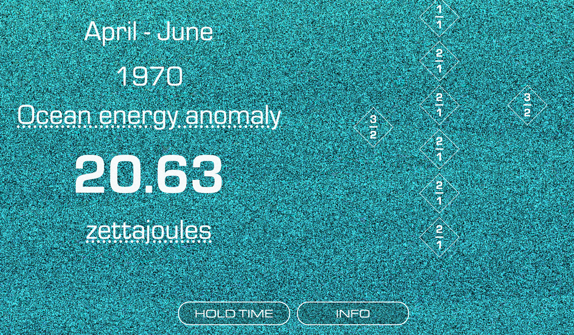
The Sound of Ocean Heat Energy
I don't remember how I first came across this data sonification, but I found the method of sonification really interesting.
"This is a data sonification (a presentation of data as sound) of the world's ocean heat content from 1970 to 2025. It represents the energy absorbed from heat by playing denser chords (with pitches drawn from an 11-limit tonality diamond) when the energy quantity is higher."
I think this is the first sonification I have come across that uses "chordal density" as a parameter mapping. The more notes in a chord, or the more crowded it sounds, the higher the value. I think it's really effective and more nuanced than pitch mapping or volume mapping.
If like me you are thinking "what is a tonality diamond" well it looks like this:

The tonality diamond visualizes notes as different numerical ratios and is commonly used in just intonation music and microtonal scales. I will resist the temptation to dive down a music theory rabbit hole here and instead encourage you to read the Wikipedia page if interested in learning more.
Learn
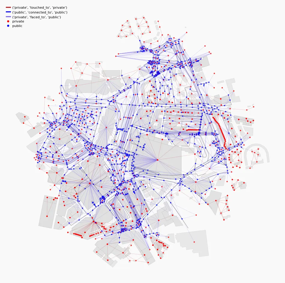
How to Use Overture Maps Like OSMnx — by City2Graph
I have included tutorials on how to make maps many times before in this newsletter, but this one is different than usual. City2Graph is a Python package that converts any geospatial dataset into graph representations. So in addition to plotting city maps, you can also draw networks of connected points.
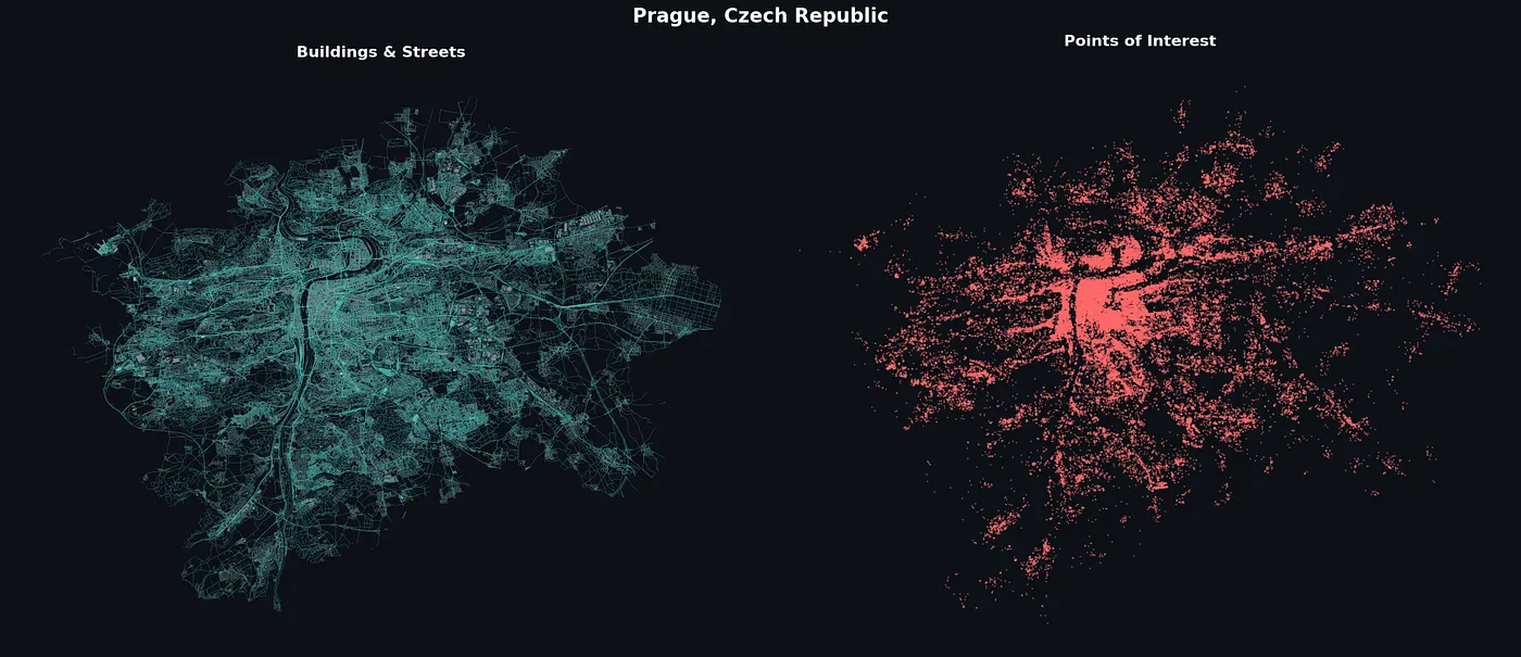
Yuta Sato does a great job showing some examples and code snippets to create these multilayered maps, along with some interesting network analysis applications you can do to analyze city connectivity. Read the full tutorial here.
That's it for now. Be back with a new edition in a few weeks, probably.